
“Good design is not what the textbooks say it is” – Interview with Tamás Fogarasy
In our mini-series launching now, we talk to professionals working in the field of digital product design, user interaction or user interface design. As a start, we asked Tamás Fogarasy, the founder of Exalt Interactive about design, career, development, and not least about the Interaction Design MA programme at MOME headed by him as an experienced digital product designer.
You started working on user interfaces during your university years, when the term ‘user experience’ was unknown to most. The profession has changed quite a lot since then. What major developments do you think have taken place? How has the UX/UI scene changed?
Originally, web-ergonomists, psychologists or developers were the first to start working on UX. I was dragged into it by a developer who did the UX stuff for that company. Later on, visual designers also started catching on to UX. And that didn’t go so smoothly… At that time, a graphic designer could hardly be expected to think in terms of architectures and systems, processes, or even to read books about cognitive psychology.
This may also have something to do with the fact that users themselves already have a better understanding of the interfaces…
In the mid-2000s, digital space was filled with many useless products and poor quality designs. Young people now are growing up using applications that are much more carefully designed. This was by no means the case in my childhood – just think of Windows 95-98 and all the software running on it.
So is it easier to make good designs today?
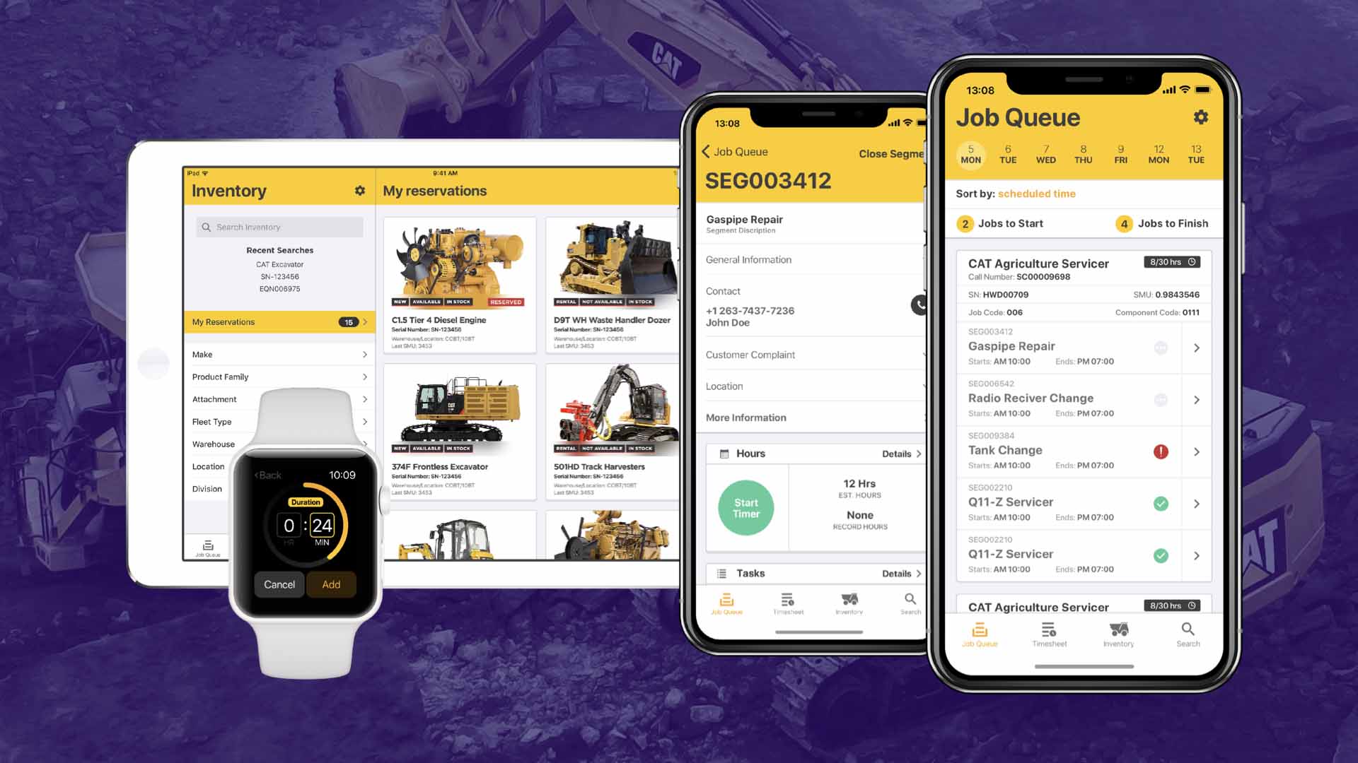
The bar for good design is raised higher. It is easier to make good stuff because you are surrounded by good stuff. The design maturity of digital products is constantly improving. Paradoxically, they are also becoming dumber, because complexity is considered to be evil. It would be practically suicide to design a software with the complexity of Photoshop and launch it on the market. No one would want to learn it. Even though Photoshop is great. There are complicated, complex things out there that need to be designed. And who will design them, if everything has been simplified to the point where the interaction model of the programs is a swipe left or right? This is a new world, where we are brought up to value simplicity and be frightened of complexity.
And we have ourselves to thank for that?
In the past, nearly all software was useless because it was full of buttons, switches, incomprehensible choices – good luck learning them. But today, it is usable because we hide the possibilities from users. We set the priorities for them, and in some cases we not only hide possibilities, we don’t even offer users an option. You get what you have. For example, you can’t filter Instagram, there’s your feed and that’s it. But this was not trivial some years ago – users at that time had all types of switches and could set a filter basically anywhere. Today, this complexity is labelled evil, and so it’s simply removed from the products. As a result, you’re no longer confronted with complexity, with interfaces where you’d need to think a little, stop for a moment, experience a little friction. Everything is designed for comfort.
It is an exciting thought, but also a bit ominous. In order to design a digital product that works well, you need complex thinking. What skills does this job require?
A solution-oriented approach is often said to be the most important thing, and it really is. There’s an issue, and instead of complaining, we are focused on solving it. That’s what design is about. A UX designer must be in love with problems. Visual thinking is another important skill. In this sense, what happens is that instead of sitting back and then writing down the results of my thought process in a notebook, I think in terms of two-dimensional or even three-dimensional space, I connect things, juxtapose them, refer back to them. The third one is critical thinking. You have to be able to take things apart, to understand why a particular thing is there. What is the explanation to it? Why do users feel they have to do something like this on an interface? This attitude is exactly what allows us not to just continue with a series of convenient functions.
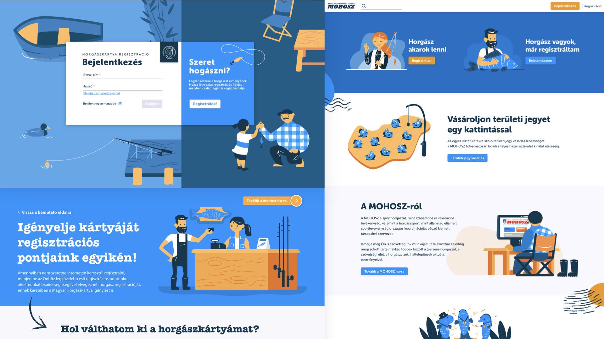
This industry has many branching off and overlapping segments, I couldn’t even begin to name the different positions. You talked earlier about specialisation – how is it decided who becomes what?
On the one hand, it is the market that decides what is needed for a particular project. On the other hand, considering the human aspect, I can see huge differences in attitudes. If you’re the type who can do it and build it, and you’re willing to work hard for this, then the UX/UI specialisation is definitely for you. If you’re specifically interested in abstractions, process-level decision making and the strategic level, you should consider UX. And if you’re best motivated by understanding the world and people, you should stick with research.
As far as I know, you are also credited with developing MOME’s Product Designer training. What is the difference between the soon-to-be-launched MA course and the MOME Open course?
We launched MOME ID to have an integrated UX training at the university, so the focus on interface design slowly shifted to UX/UI. For this reason, most people who apply for our course are those who want to strengthen their skills within a company, or career changers who have reached a dead end in a particular field and would rather move on. Whatever the case may be, something they all have in common is that they left the academia a long time ago, and are looking for something they can do while working. And ID is just like that, with courses held in the evenings and at weekends.
Could you tell us a little bit about the Interaction Design MA programme?
The first of the four semesters is, of course, about learning the fundamentals. Previously this was covered in the smaller UX courses, but the point is the same: to have a strong basis that can be consolidated as soon as possible. The second semester will be about the market and different technologies. The focus here is the context – what exactly affects us? What sort of technological and business environment are we going to be surrounded by? The third semester is about experimentation, once the basics have been mastered and limitations are understood. But how can we break these down? The courses here are built around creativity, planning visions and speculation. Then comes the last semester, dedicated to the masterwork. At the same time, everything also has a theoretical dimension, including social science, anthropology, research, research methodologies, humanism, post-humanism, so philosophy can go hand in hand with hands-on education. In fact, the academic environment also means that we can see beyond what the profession actually means.
The curriculum sounds complex, but what about prospective students? The course will be in English. Is it targeted specifically at international students?
Our vision is to ensure a strong international presence and reputation for the university. Initially, we are focusing on the CEE region, then proceed to launch a world-wide application programme – students can apply from all over the world. From a professional perspective, we are not lagging behind, we can certainly offer strong training in European comparison. Hopefully, in five years’ time, there will be no question about MOME being featured in the international press when it comes to interaction design.

What opportunities will the graduates have?
They will be able to navigate the job market. Today, even career starters are required to have at least three years of experience by default, so it is the university’s responsibility to bring the market closer to the students. And this involves not just giving students a degree, but rather helping them understand exactly how the world they are about to enter works. An equally important part is to train mindful designers who have not chosen this career because they had to, who have not studied rigid systems, but who can experiment and reinvent things in an academic environment. Sure, you can read books, download a tutorial, watch videos, but that is actually the toxic part. Good design is not what is in the textbooks. You can create good design if you’ve had the opportunity to experiment, if you understand where the professional boundaries are, push them a bit, play with them and reinterpret things. This is definitely an added value in such training that you can’t get in any other way, because once you are on the market, you can no longer completely challenge things.
Who do you recommend the MA programme to?
Primarily to those who have already looked into what it is. Or to those who are already working with it on some level. In addition, I would expect students who are interested in technology, in Human Computer Interaction to apply. It requires a certain level of geekiness, because we’re not just talking about looks, but about the digital services and products that we interact with on a daily basis. If you’re the type of person who wants to influence the way the world works, I recommend this programme to you.

// /
Interaction Design MA | Exalt Interactive
