Consumption criticism made suitable for consumption – A portfolio by Vilmos Sas
Familiarity with and competency in using the toolkit of graphic design means having a powerful weapon at your disposal by being able to communicate a message so that it appears true and reliable to the recipient. According to Ruben Pater, one of the chief functions of graphic design is to gain the trust of the desired target group. Although it is often argued that true responsibility lies with the clients rather than designers, graphic designers must inevitably face the dilemma of how to use (and not abuse) the possibilities offered by visual communication. Second year graphic design student Vilmos Sas is seeking to explore aspects of taking ownership using the tools of graphic design.
Buy Nothing Day campaign
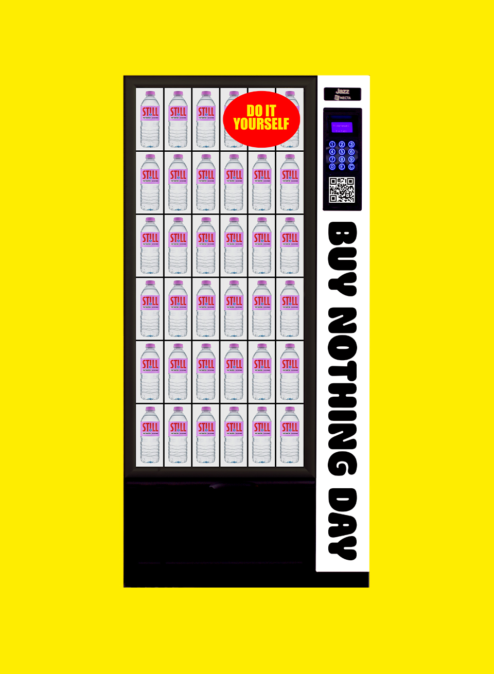

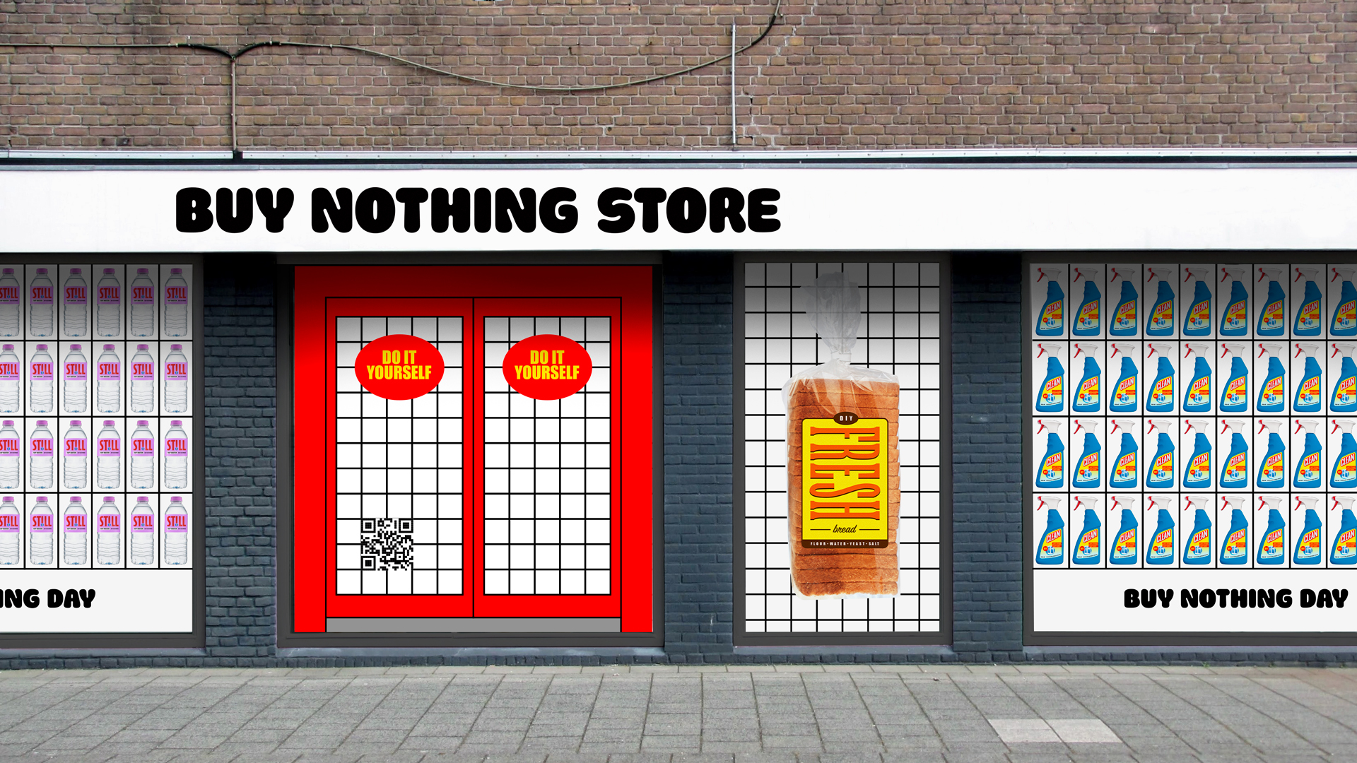
Buy Nothing Day is an international initiative designed to reduce overconsumption. Vilmos’ fictive campaign is based on a simple idea: it shows that packaging as a communication interface can also be used to communicate radically different messages from the ones promoting purchase of the product. For many of us, packaging is an interface that readily lends itself to easy understanding. Yet with a little mocking twist it can be turn into the exact opposites of its original purpose. Vilmos is encouraging people to make a given product at home instead of buying it, thus creating a meta campaign that reflects on itself critically.
My coffee, our planet
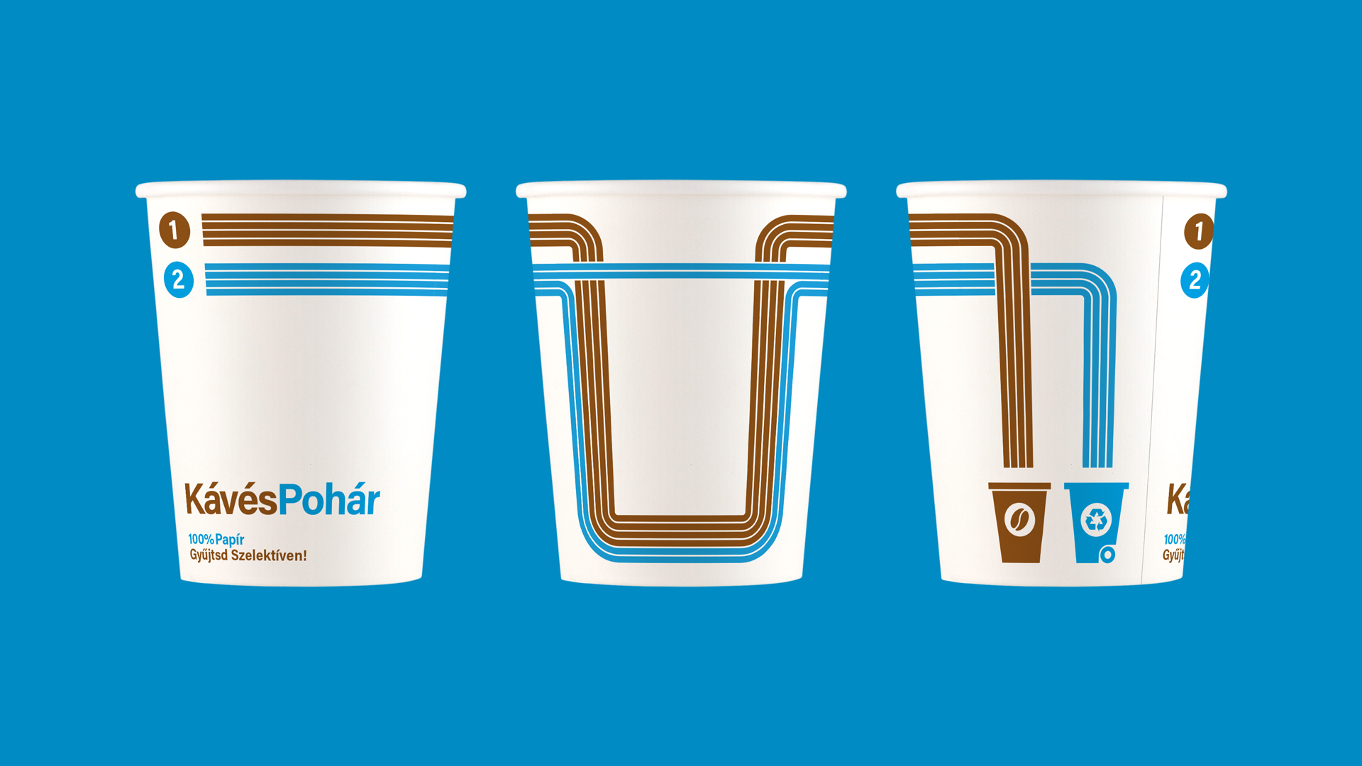
Coca Cola is replacing its existing plastic cups for hot drink vending machines with recyclable paper cups, and MOME students could submit entries for the visual design of the surface of the cup. A problem Vilmos identified is that many neglect to collect waste selectively to this date, using inconvenience as an excuse. If someone, however, points it out to you, you might make the effort and put up with the inconvenience involved. This way the cup acts as a reminder: it brings the importance of selective waste collection to the attention of users by displaying the blue bin and the path leading to it.
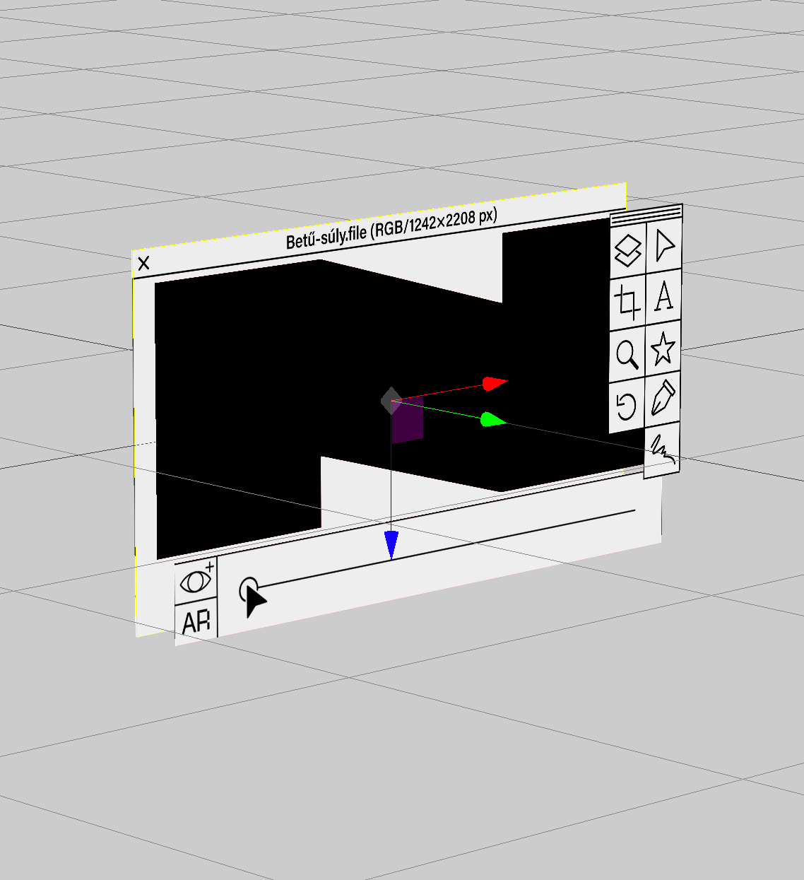
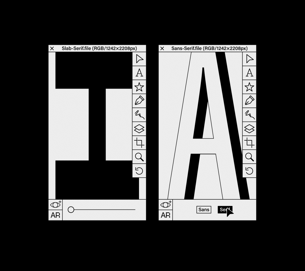
TypogrApp
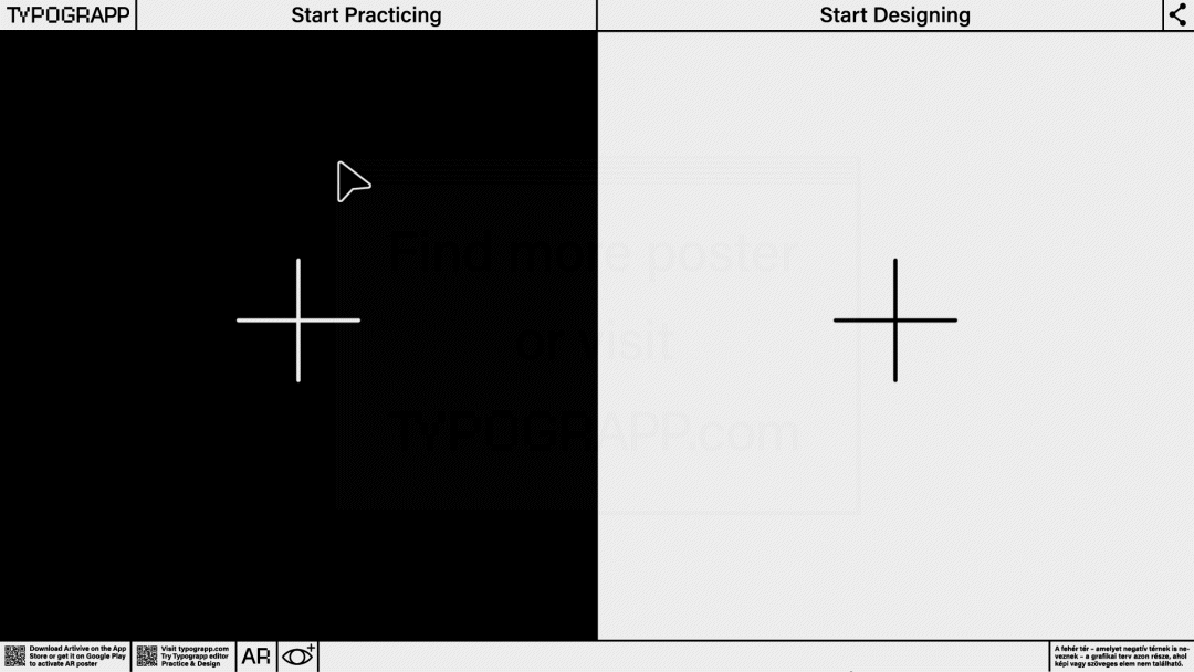
“TypogrApp is a browser-based vector graphics tool providing a platform to help students work on their own projects and access the graphic design concepts displayed on the posters for the software”, says Vilmos, summarising the substance of the project. It is designed to make high quality graphic design accessible to those who do not necessarily need complex software but do not want to use illegal software versions.
The project was further incubated by the Stefan Lengyel Scholarship. It also included the development of an economic model proposing that the company behind TypogrApp function as a social enterprise which committed from the start to investing its profit into the operation of the business, product development and – through scholarship programmes – talent development. As Vilmos puts it, “This way, the brand could set itself apart from its competitors, and would apply the principle of capitalism in a way other than to serve its own interests”.
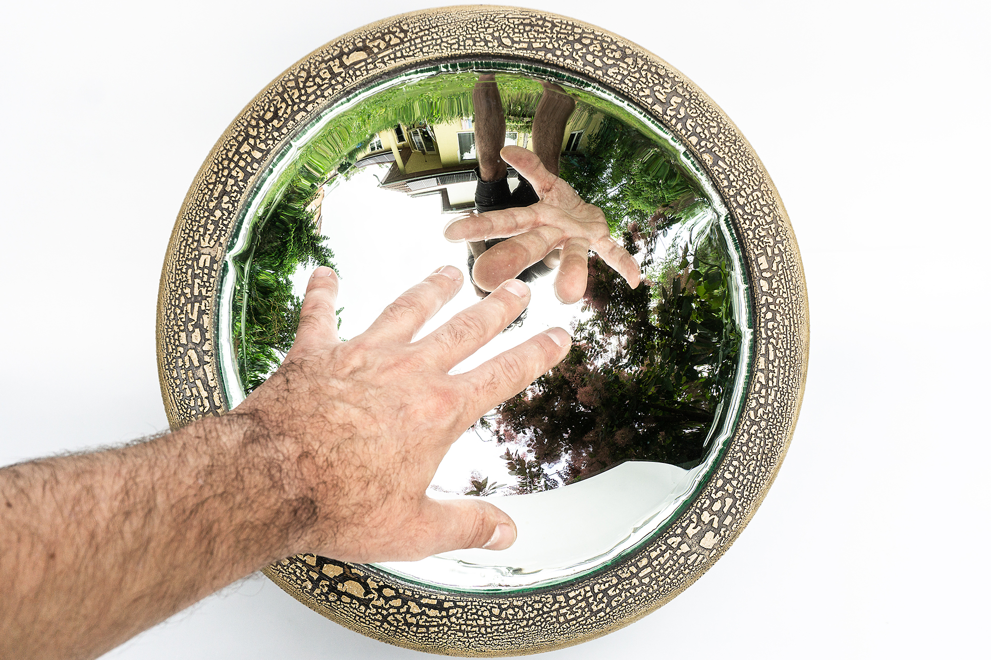
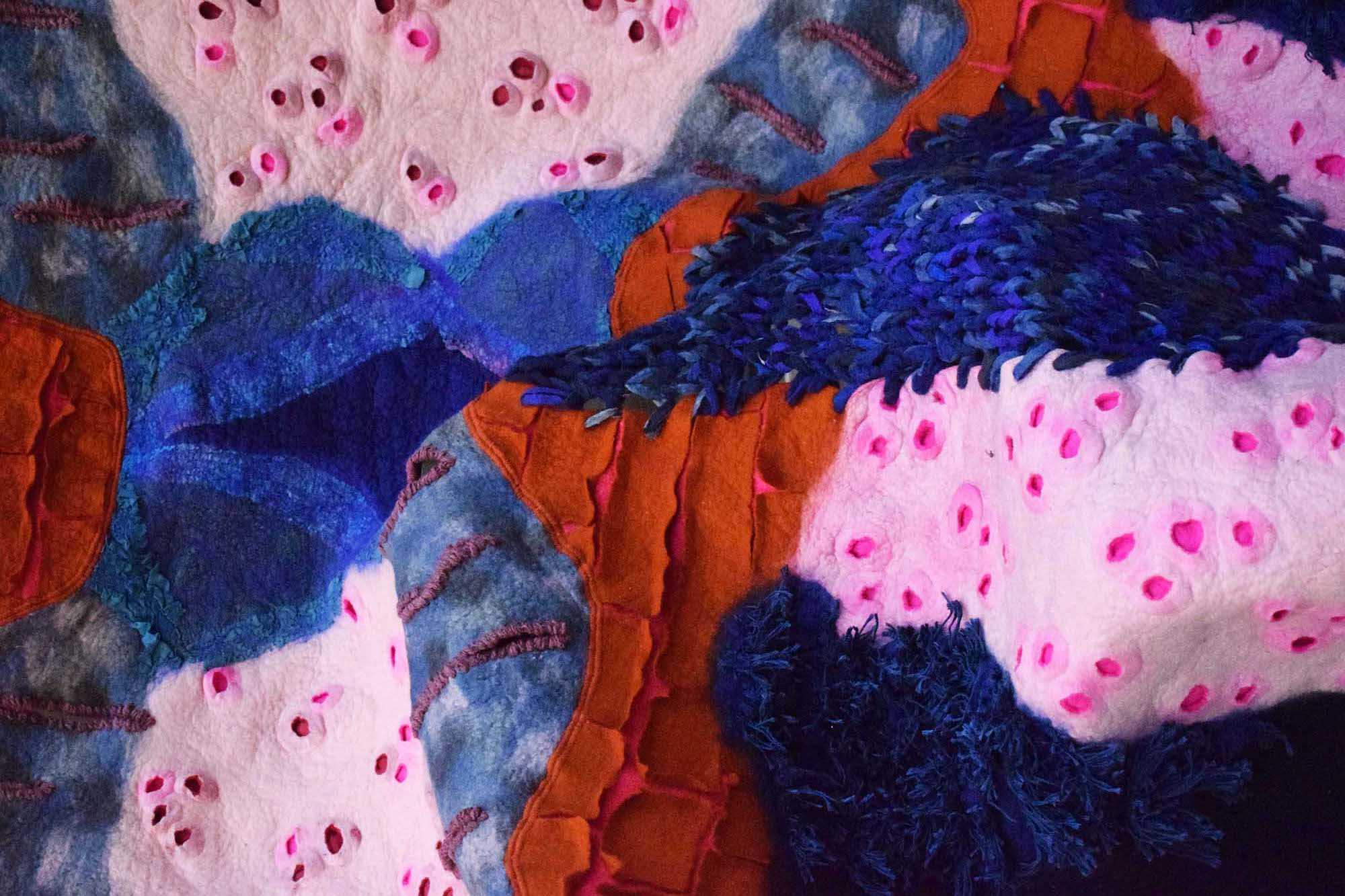
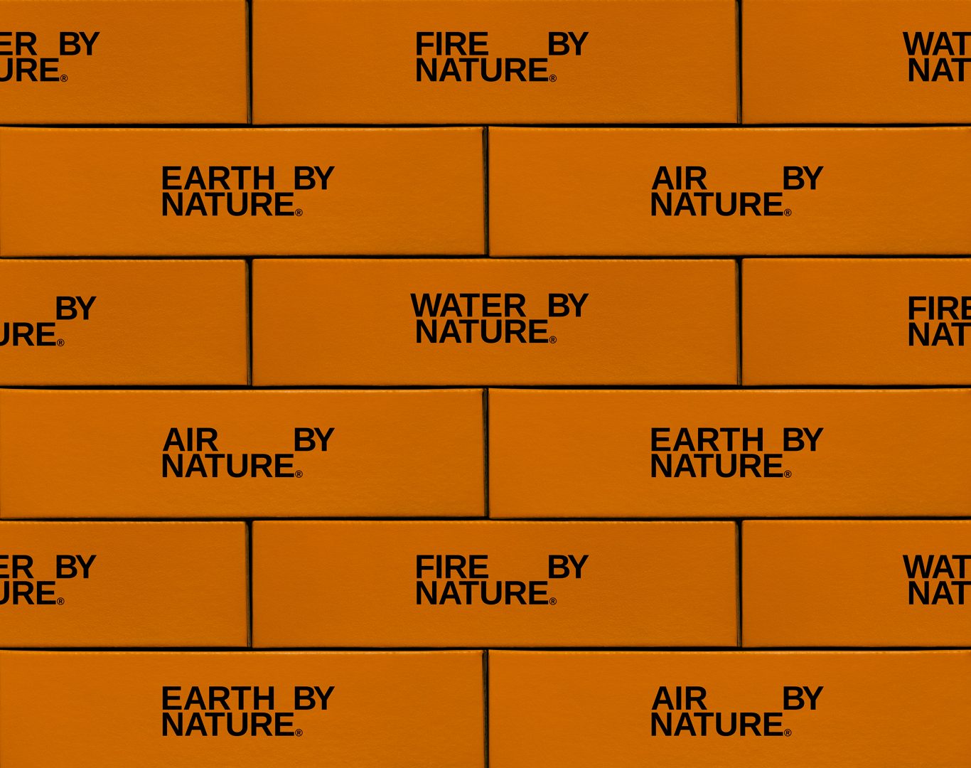
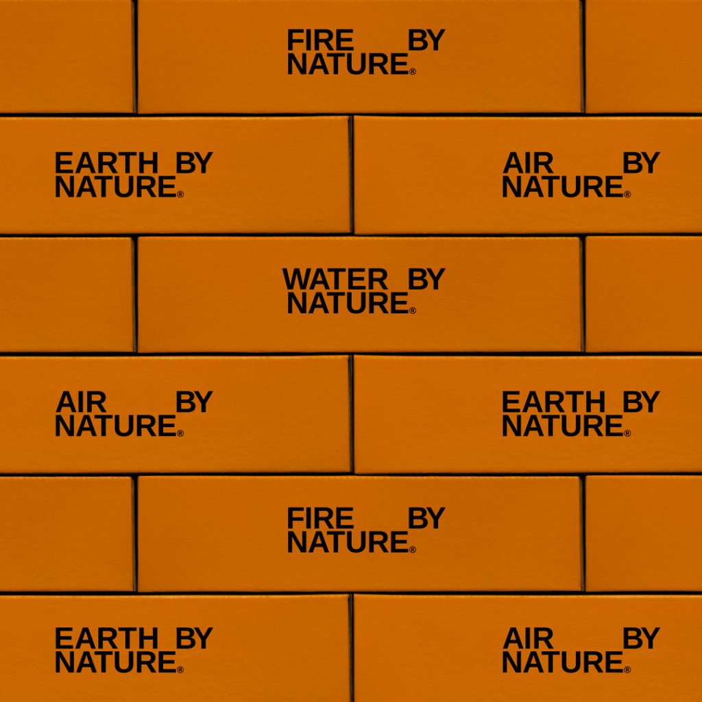
By Nature
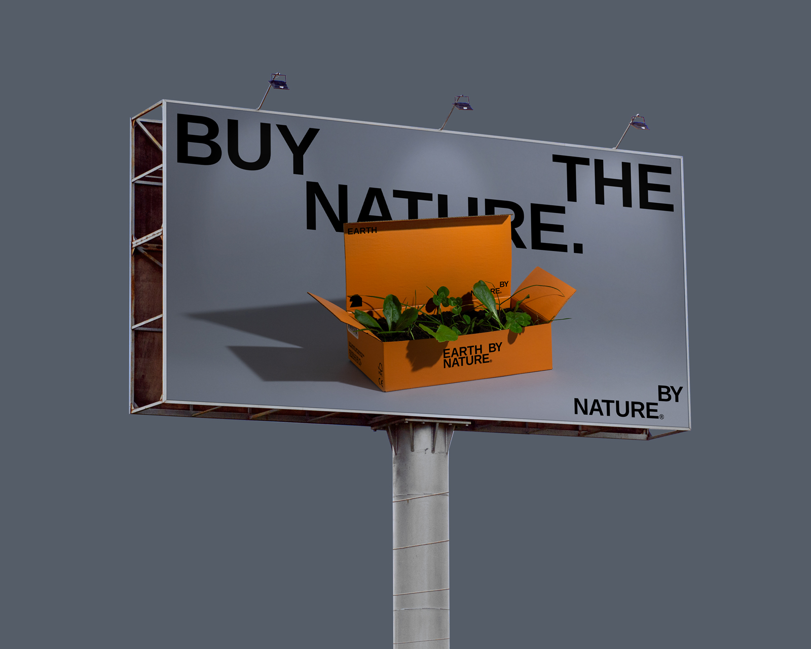
“I think the most powerful force that affects is nature, and yet we don’t appreciate it enough as opposed to brands, which we value above perhaps everything else today. My goal was to ensure nature becomes valued as highly as brands are. For this reason, I have created a brand called ‘By Nature’.”
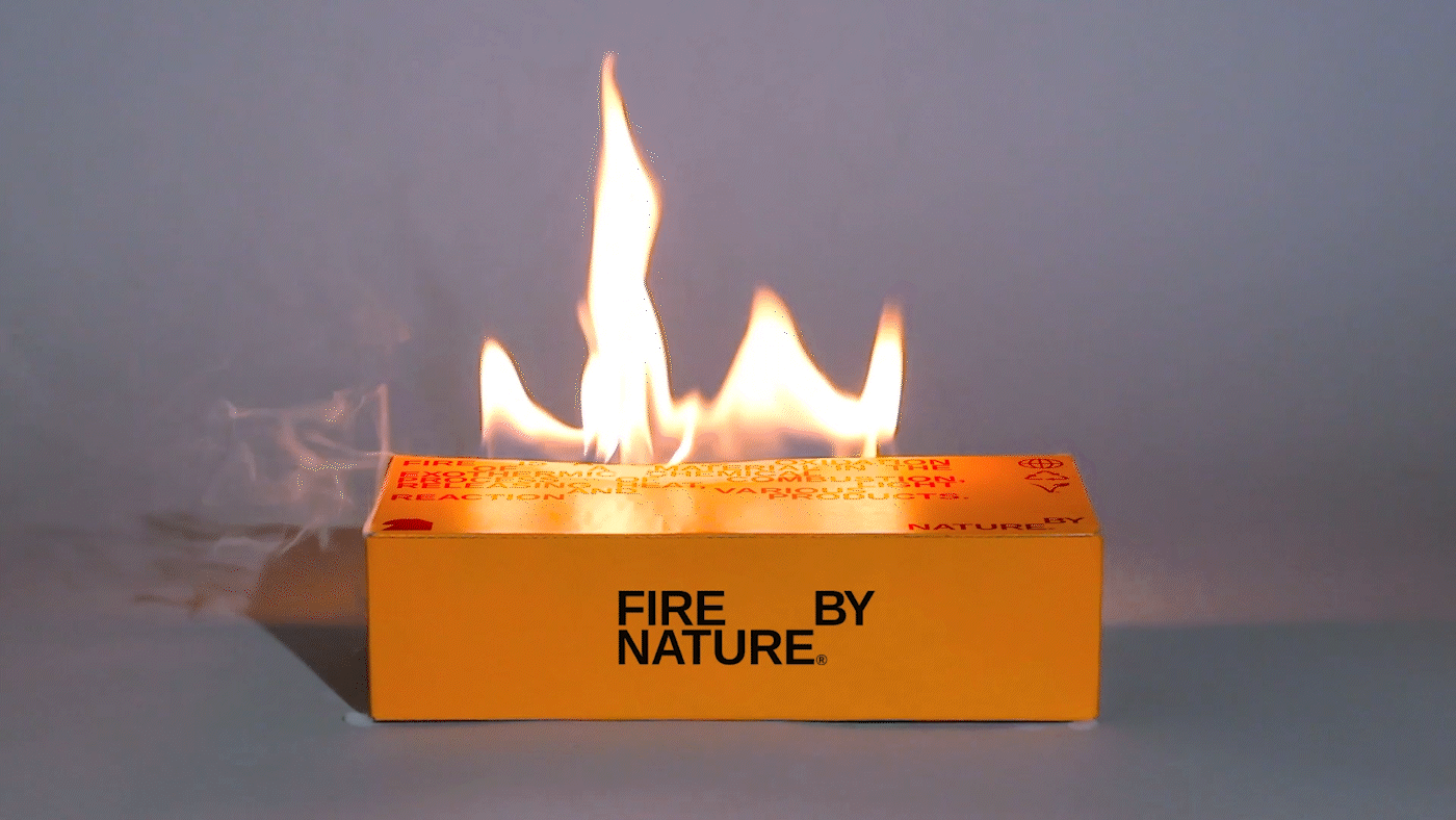
By Nature incorporates nature as a brand into consumer thinking, and popularises nature by positioning it as a strong brand. Though the project is a sort of experiment, according to Vilmos it could also be viable as the campaign of a nature conservation organisation – it would just need to be transplanted to the customary promotion interfaces, just like “real” products.
Central Library
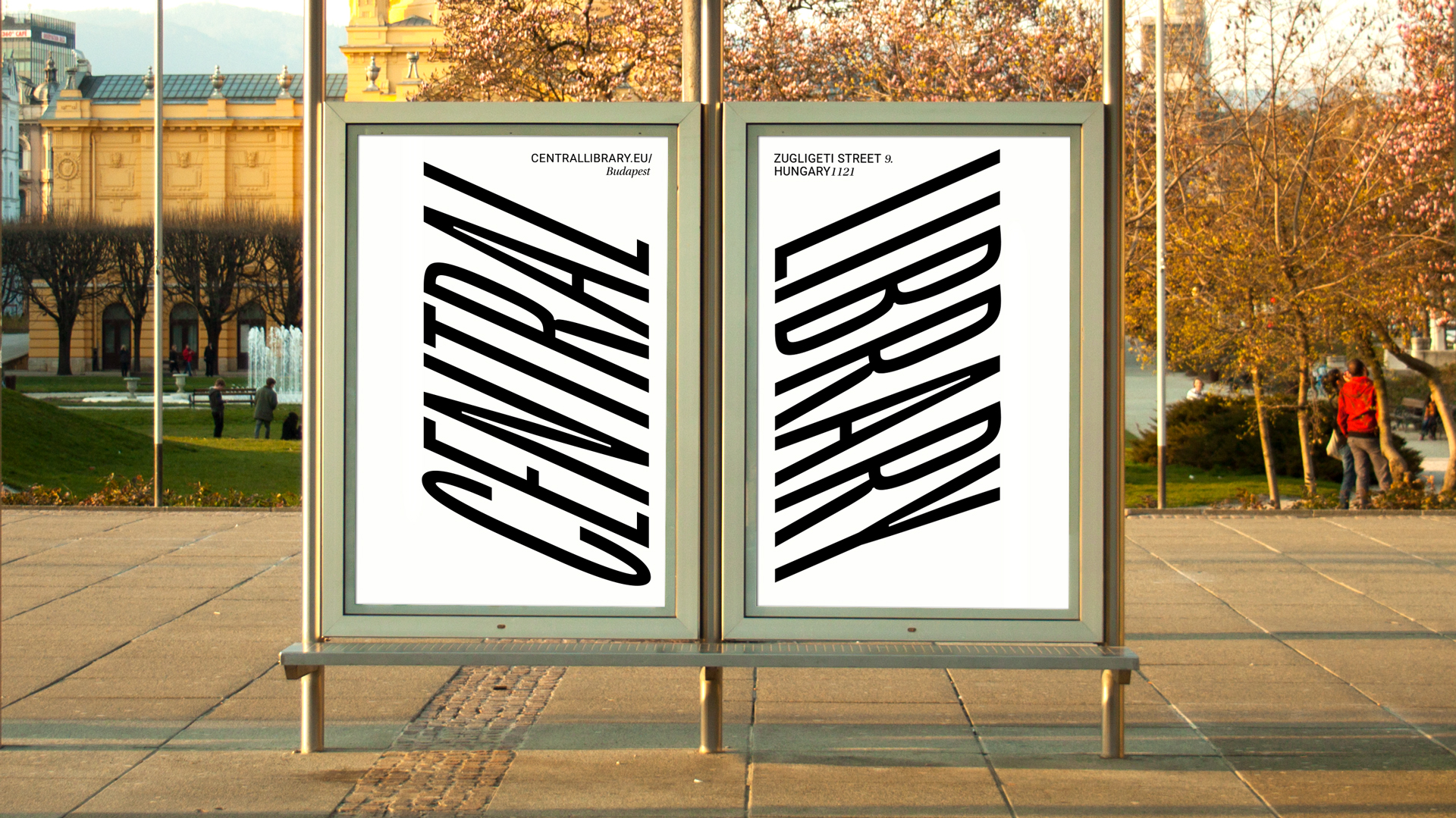
“Central Library is designed to share the knowledge base available to it as a network of libraries located in European capitals. The online library enables researchers to access documents from the libraries of any country in one place. The offline cultural space belonging to the online library not only offers a quiet environment for research work, but its extreme, unusual, and creative inspirational rooms jolt researchers out of the black-and-white world of book reading, thereby inspiring the design process.”
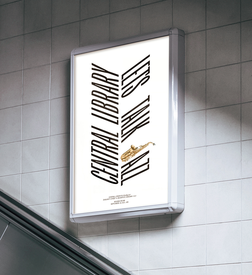


Unique features of the visual identity includes the Central Display font designed by Vilmos. This font is a reflection of the visual identity itself, centred around the open book emblem created around space-cube associations.
// /
Further works by Vilmos are available HERE and HERE
The projects were completed at the Graphic Design BA of Moholy-Nagy University of Art and Design