From The Beatles to LGT – A brief history of vinyl covers
Though Spotify is unquestionably on a solid roll in music distribution, contemporary bands have a penchant for also releasing their albums on vinyl. It is a huge marketing hit with audiences receptive to analogue technologies that are currently enjoying a revival – after all, in between browsing among jpg and mp4 files, it is a nice change to pick up a record with a unique design and display it on the shelf. This flourishing trend presents the perfect occasion to reflect on the visual whirlwind of older and new vinyls in record stores or home collections.
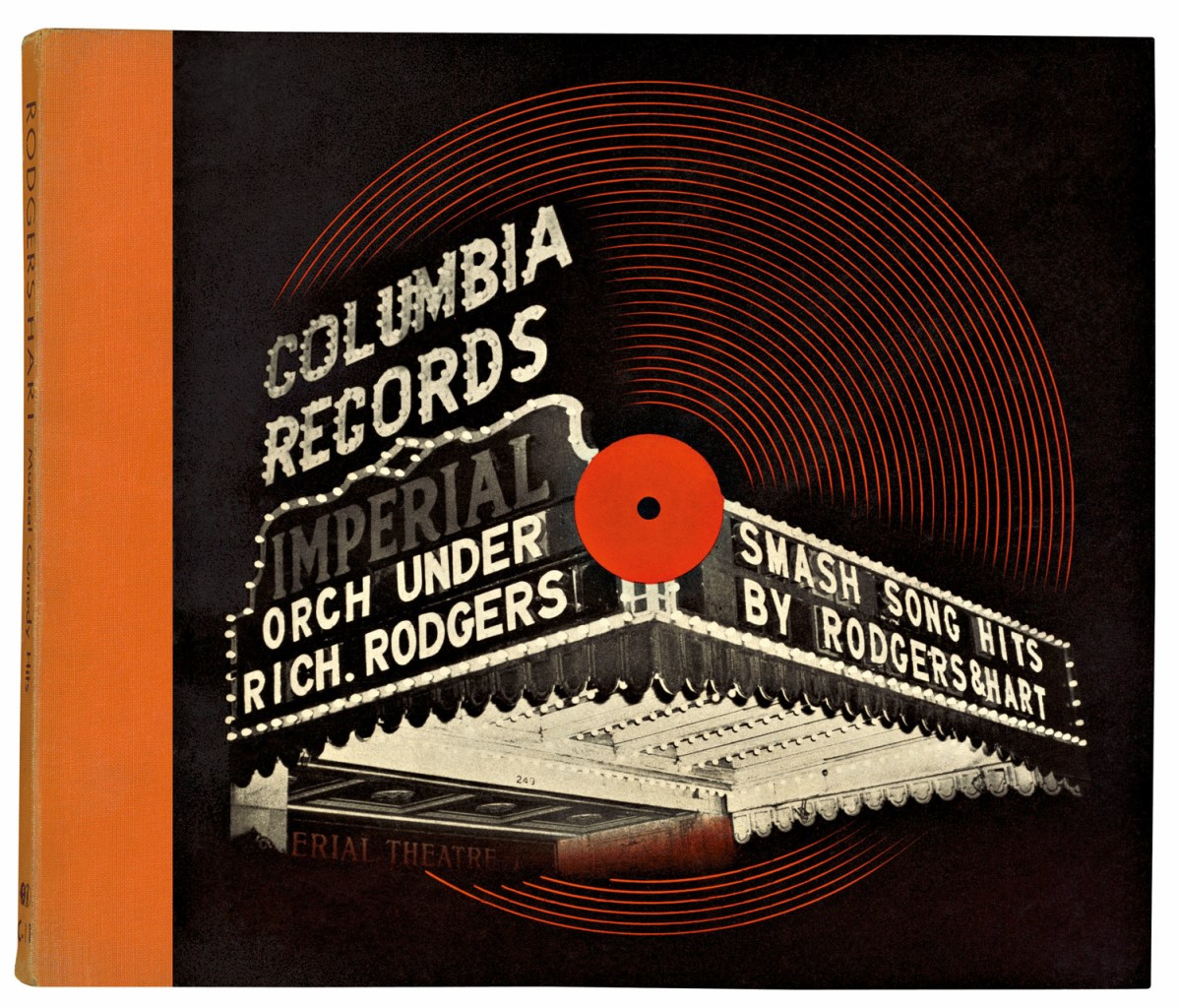
Alex Steinweiss: Columbia Records – Imperial orch under Rich. Rodgers – Smash Song hits by Rodgers & Hart, 1939
As a matter of fact, records did not have a cover until the 1910s. Initially, they were stored and transported without any packaging, and later, jackets were used mainly to provide protection and display the necessary information [1]. The visually stinted rule of the sleeve and plain cardboard jacket combo lasted until the late 1930s, when art director of Columbia Records Alex Steinweiss came up with the idea to design a unique cover for each album. By refreshing the dull looks of covers, Steinweiss sought to visually reinforce and convey the musical message and boost sales of the albums. It became an instant hit: Columbia Records’ reissue of Beethoven’s Symphony No. 5 with a cover designed by Steinweiss for example produced a 894% increase in the sales of the album [2].
The advent of unique album arts gave rise to a new category in graphic design.
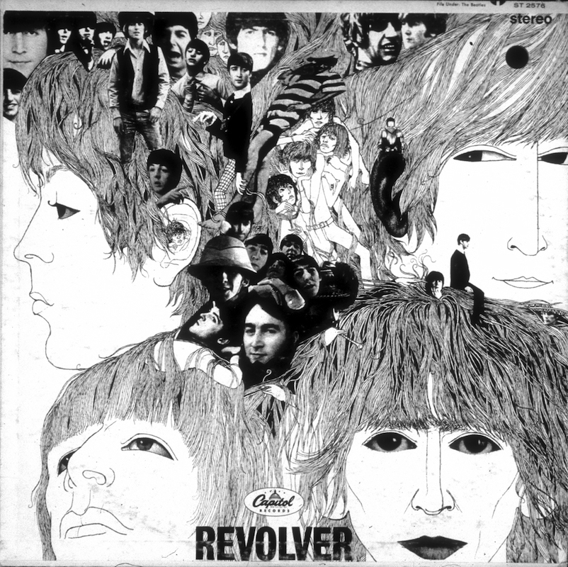
AUGUST 6: Album cover designed by artist Klaus Voorman for rock and roll band “The Beatles” album entitled “Revolver” which was released on August 6, 1966. (Photo by Michael Ochs Archives/Getty Images)
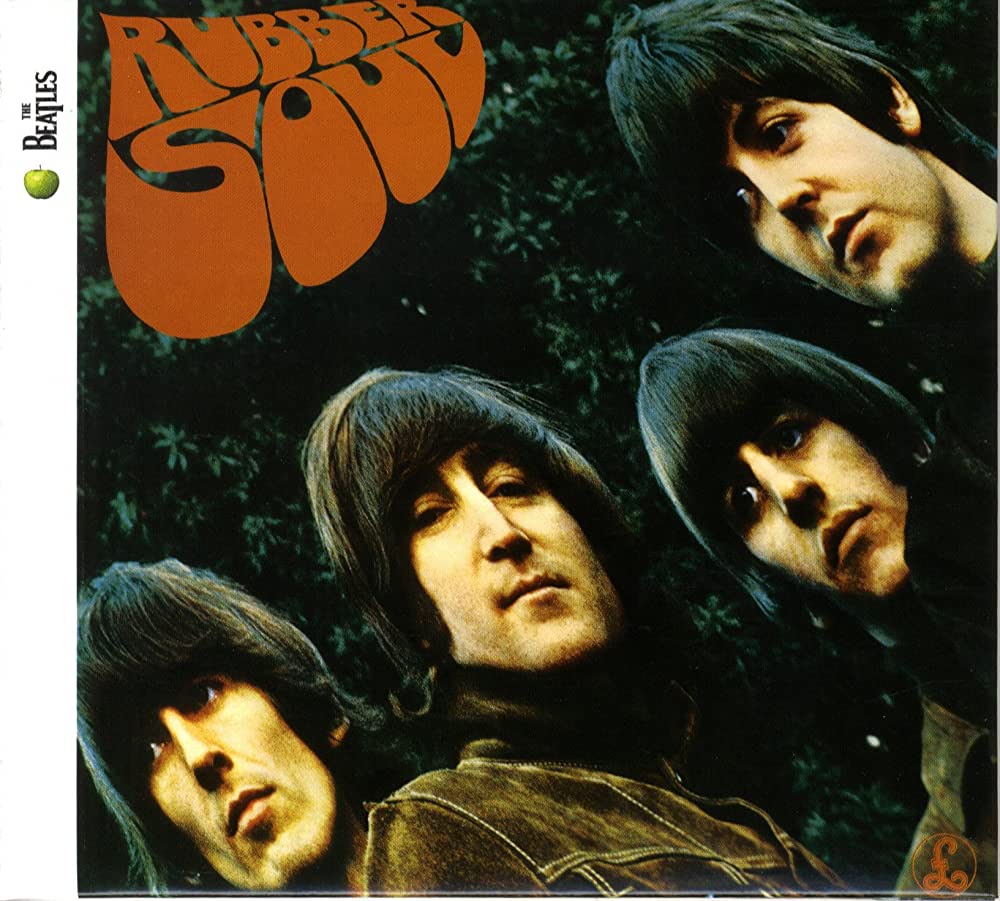
The Beatles: Rubber Soul (1965) / The Beatles: Revolver (1966)
The golden age did not come until the 1960s. The exhibition Jugendstil and Expressionism in German Posters took place in the middle of the decade at a university in California and was a major influence for local artists and graphic designers. Psychedelia came into being at the intersection of their own art, pop art that was gaining traction at the time, and Art Nouveau influences [3]. This was the first movement whose main form of expression were concert posters and album covers of the booming hippie culture using the tools of graphic design. Instead of simply imparting information, psychedelic posters took culture consumers into unique fantasy worlds, and their high-quality and inventive design made advertisements at the time seem positively dull and sloppy. [4]
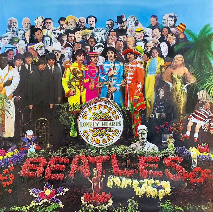
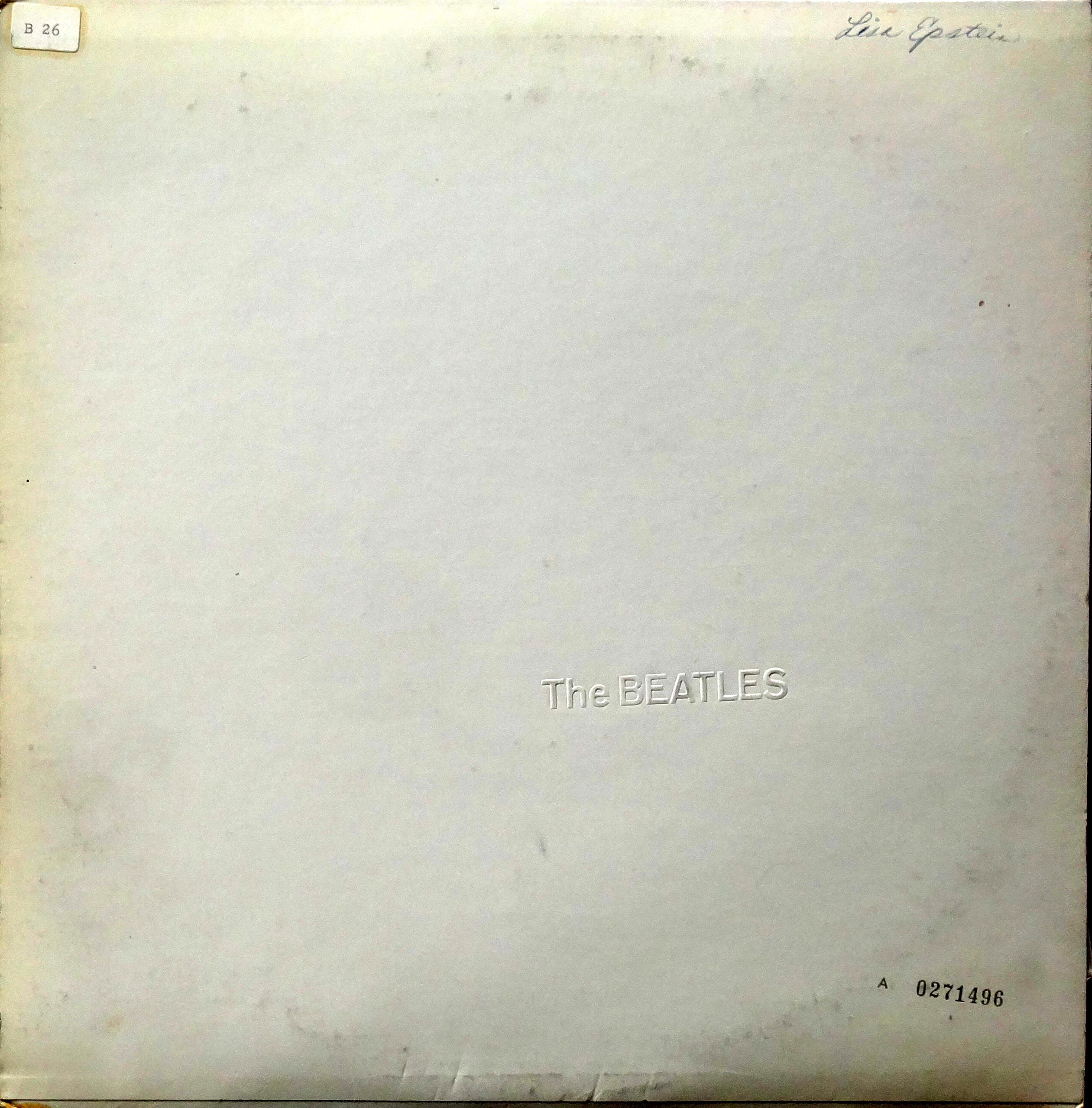
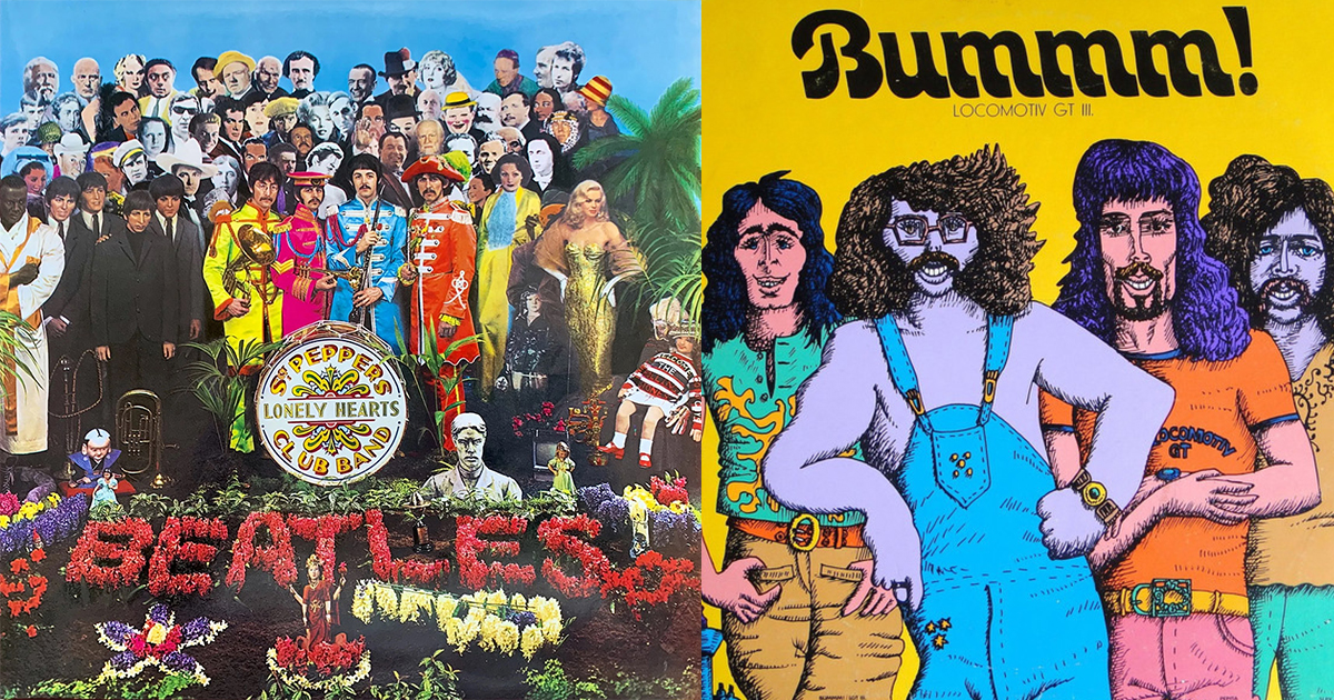
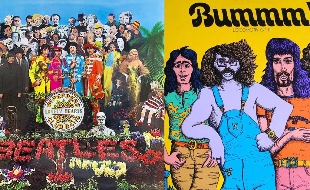
The Beatles: Sgt. Pepper Lonely Hearts Club Band (1967) / The Beatles: The Beatles (1968)
Some of the Beatles’ album covers are a perfect example of pop art and psychedelia, as well as the increasing complexity of album arts. Released in 1965, Rubber Soul is regarded as the first psychedelic album cover with its oddly distorted photo and Art Nouveau calligraphy. The cover of their next album, Revolver, featured a pencil drawing collage designed by Klaus Voorman, which marked a drastic departure from the loud visual style of the period, while the diversity of the songs hinted at the experimental side of the band. Peter Blake and Jann Haworth’s design of Sgt. Pepper Lonely Hearts Club Band was an even more ambitious feat – the band members are depicted surrounded by celebrities who had been the greatest influences for them, including Carl Jung, Edgar Allan Poe, Bob Dylan or Karl Marx, as well as their own alter egos dressed in a suit and tie representing their old selves. Beyond the attractive design, the packaging was also revolutionary, with lyrics on the back and a gatefold cover. The LP was inside one pocket, while the other one hid some little toy – a cutout Sgt. Pepper moustache, badges, or figure. [5]
After their first psychedelic album cover, the Beatles created their first concept album around a specific subject or thought.
Designed by Richard Hamilton and Paul McCartney, White Album marks a sharp shift with a clean white cover embossed with the name of the band in Helvetica font. I believe with this album design, the Beatles and Hamilton transcended its previous scope, and ventured into the domain of the postmodern. [6]
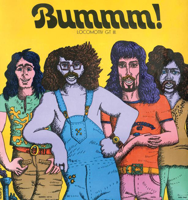
Locomotiv GT: BUMMM! – Locomotiv GT III. (1973)
Like the collaboration between the Beatles and Blake or Hamilton, Locomotiv GT and György Kemény’s work together can also be seen a groundbreaking combination of rock music and pop art in the Hungarian music scene of the 70s. Some of the artists in the Eastern block actively watched for and responded to international trends, which meant Western pop swiftly popped up in the region. Kemény was also among those who got the “pop bug” during his trip to Paris, and soon incorporated it into his own graphic design toolkit. At the same time, Central Eastern European artists had a local twist on pop art, and used it to parody the false ideology of Social Realist art and in response to the non-existent mass culture. It was an attempt by Hungarian artists to reclaim their autonomy curbed by state control, and can be regarded as a counter culture to Leftist ideology.
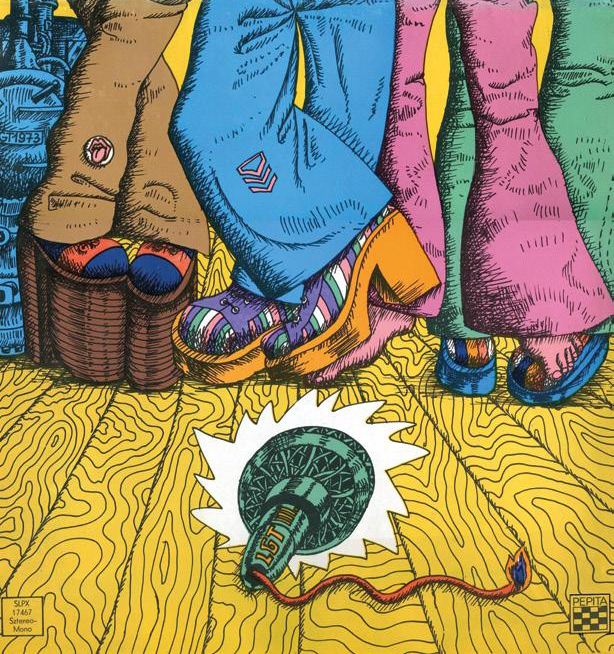
Western influences did not pass LGT by when they had shows in the UK and the USA. Already back in the 70s, Presser and his band were affected by hippie culture appearing in Hungary, as mostly reflected in their clothes and long hair. [7] Mostly created by Kemény, the covers and album photos of the band were also aligned with this trend. Their most famous collaboration is the 1973 album BOOOM! with an album art featuring a half-length, caricaturesque picture of the band members, comic book-style, against a canary yellow background typical of Kemény’s posters. Unfolding the cover reveals a full-length picture of the band through a vertical gatefold. The flares and shoes in the cover art mirror 70s fashion, with hippie culture and pop art symbols, like the Rolling Stones’ tongue and lips logo designed by John Pasche. It is also displayed on József Laux’s trousers, a mere two years after it was introduced in 1971.
The history of the album was not exactly uneventful. The album art was found to be too garish and Westernized, and was eventually banned by head of the Hungarian Record Company Jenő Bors. Then one day, before the band was set to perform at the World Youth Meeting in Berlin, Presser struck up a conversation with Chief Secretary of the Young Communist League József Gombár, who, upon hearing about the ban and its negative impact on the band, immediately made a call to the Record Company. According to Kemény, all Gombár said over the phone was “I don’t care what’s on the picture, just release it!”. However, because of Tamás Barta’s defection, the album was later banned again.
// /
The article is an excerpt from Márk Szolomájer’s thesis The Relationship of György Kemény and Locomotiv GT. The research was conducted at the Design Culture BA programme of the Moholy-Nagy University of Art and Design, with Eszter Földi as his consultant.
[1] [5] Jones, S. & Sorger, M. (1999) Covering Music: A brief history and analysis of album cover design, Journal of popular music studies 11-12, no. 1
[2] [6] Medel, I. L. (2014) Death and resurrection of the album cover, https://www.researchgate.net/publication/260424430_Death_and_resurrection_of_the_alb um_cover
[3] Barnicoat, J. (1972) A concise history of posters, Oxford University Press
[4] Poynor, Rick (2005) Communicate: Independent British graphic design since the sixties, Yale University Press
[7] Dávid Fehér (17/09/2016) Kemény/POP (György Kemény and Pop Art), Artmagazin, issue 90,