From graffiti to precise design – Bercel Hegyessy’s portfolio
He killed time creating graffiti when hanging out in Újpalota. Initially he was inspired by the flamboyance of the 70s, and his attention was captured by shapes and fonts from Brooklyn, which, despite their perfect precision, also reflected a childlike naivety. Bercel is driven by the same duality in his remarkable creative process. His works were inspired by Gesamtkunst influences and their in-depth research. He approaches emerging issues methodically, setting up a strategy and scrutinising every small detail.
FONT SAMPLE BOOK
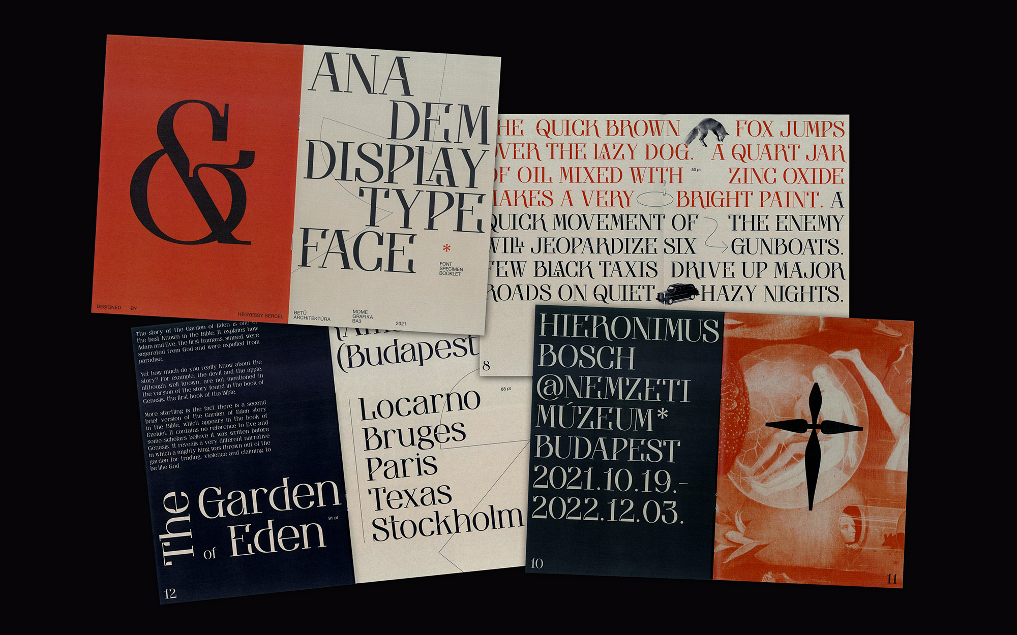
“I pick fonts over beer. They are the only thing that can keep me at home”, he says, spelling out his close relationship to fonts in no uncertain terms. He combined modernist Serif characters, a surprising use of ink traps, varied line thickness and organic links in his designs over the past 6 months.
“Somewhere around Gutenberg tér I found a label left from the Belle Époque. I took a fancy to the weathered letter K, which reminded me of an ink trap. It became my point of reference. This design is a synthesis of all that I’ve been thinking and feeling for years. I’m strongly attached to it, because it marked a point where it became clear to me that this is what I want to do.”
CHERNOBYL VISUAL IDENTITY
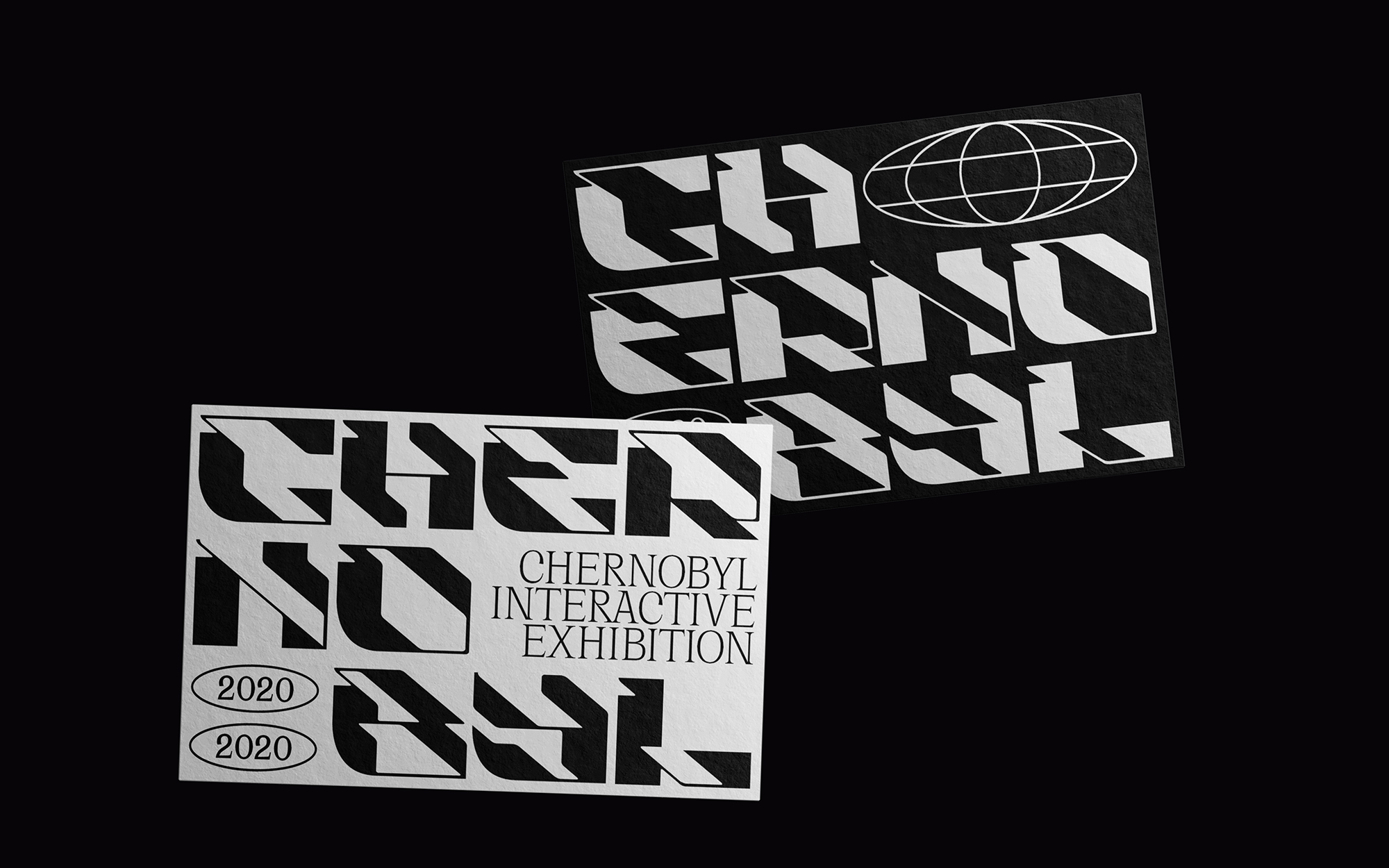
His Chernobyl visual identity design also has a robust intellectual foundation and a dose of eclecticism. The font is suggestive of Brutalist architecture, while the pixelated flora is a reference to purity brought back to life, which, however, can never be what it once had been.
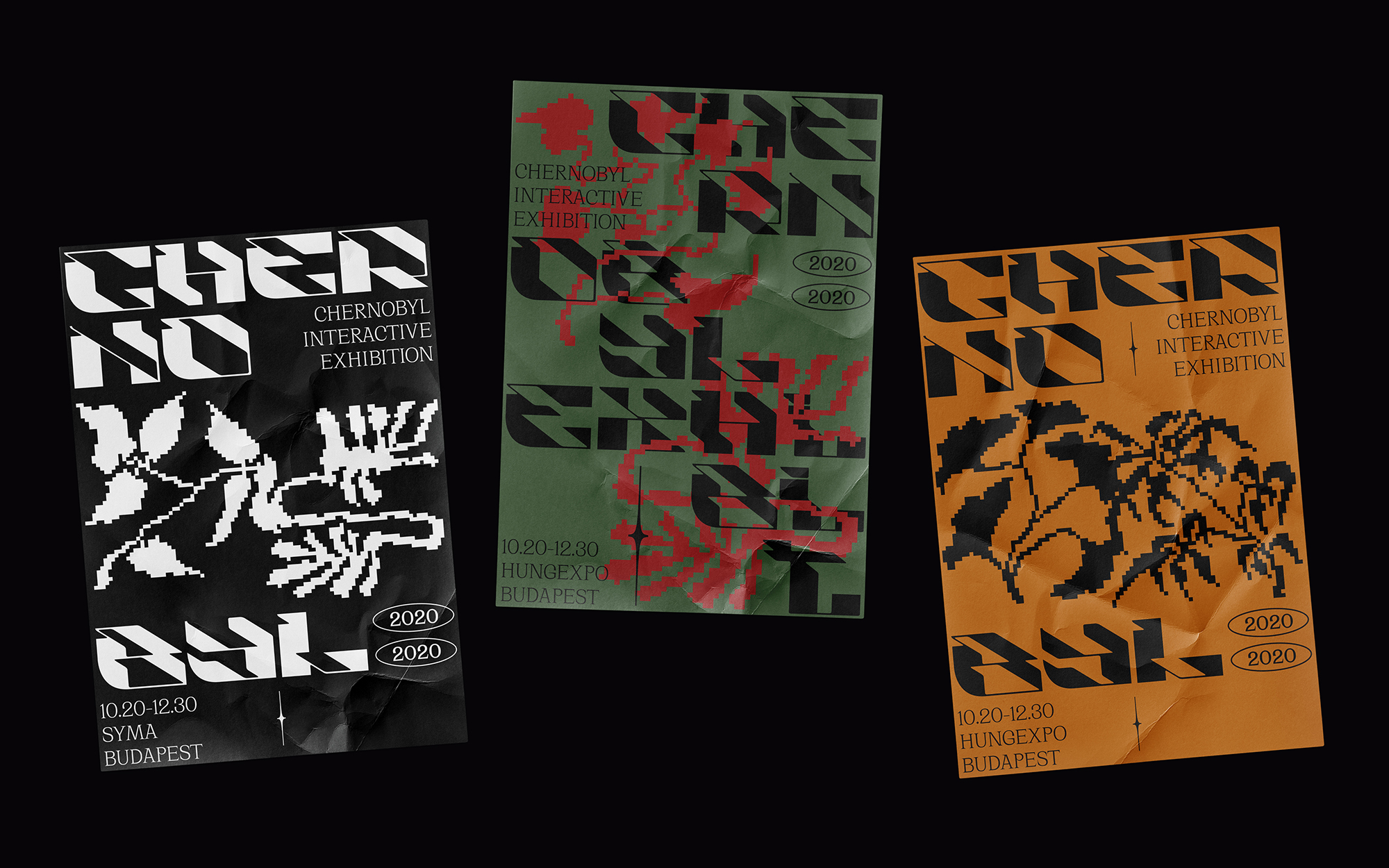
“The font set has been my first design, and taught me a lot. It is grid-based, which I now find a bit forced, but I like it all the same.”
A MAGPIE IN THE REALM OF ENTHROPY
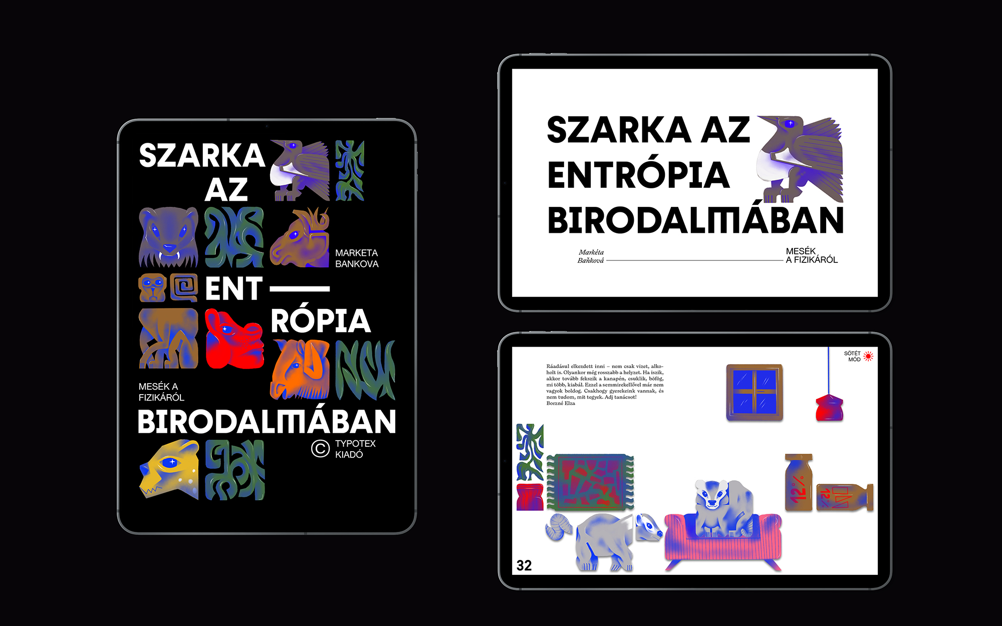
The grid-based visual style of his animal fable A Magpie in the Realm of Enthropy has a fresh but unique aesthetic quality and vibrant colours. It is characterised by expertly composed typography and forms. The Grotesque fonts are working well and are easy to make sense of. Despite the richness of detail and colour, his designs are never cluttered or gaudy, but spacious and carefully arranged. To accommodate the target group of young children, his characters change with a playful ease when switching to dark mode, floating in and out smoothly and moving in a manner suggestive of child-like naivety.
PASTA DEL FUTURO
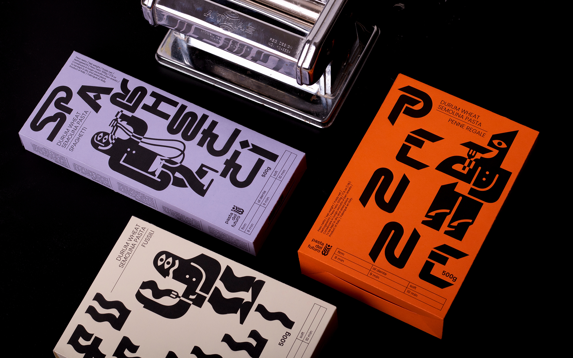
How could typography be fully freed? Bercel reached a futuristic style on his journey of looking for answers. Although in the avant-garde, it was often possible to match the appropriate typography to the assignment, the classic rules were completely broken.
“Avant-garde was building from chaos, which I believe is very human. If came across a cookbook by Tommaso Marinetti, known as the father of Futurism, which contains performative recipes. I wanted to link these two: the Italian theme, and graphics that organically incorporates pasta.”
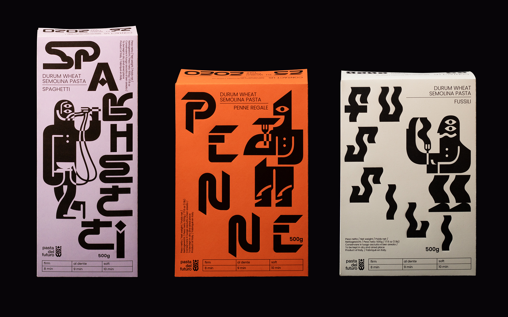
He included elements of futurist designer Fortunato Depero’s iconic Campari design, such as the prominent use of spots, dynamic lines and font variations. As a central feature, he adjusted the illustrations and typography to the characteristics of the pasta for each packaging, in a geometric, and at the same time, freer, goofier design. Although each letter bends a different way, they keep their functionality by remaining legible, while retaining the, bold, experimental character of the avant-garde.
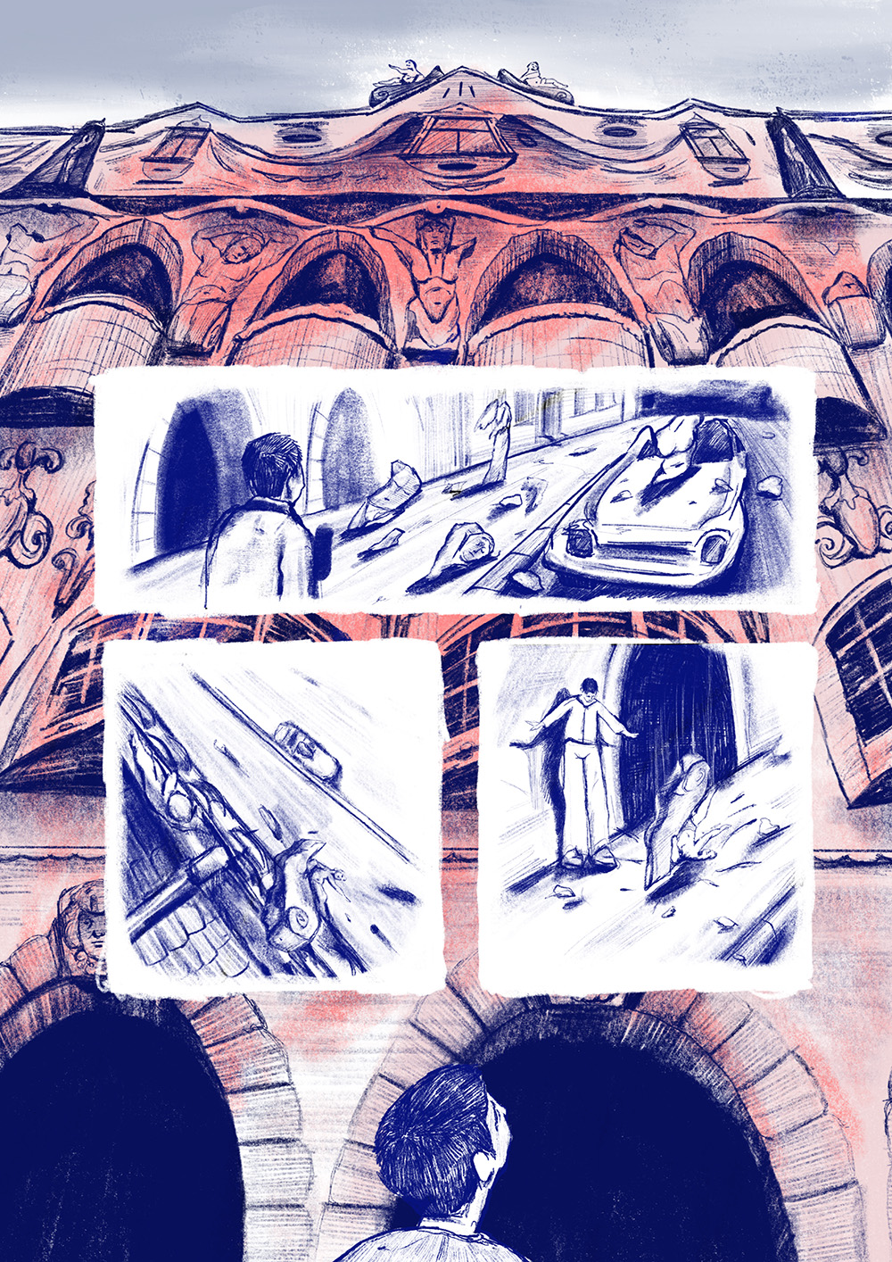
WERCKMEISTER HARMONIES
Initially, Bercel perceptibly takes a flexible approach to his assignments in order to be able to identify with them next. The alternative title credit created for Werckmeister Harmonies exudes the unique and melancholic atmosphere of Béla Tarr’s films in a captivating manner. The film’s tone is reflected in the slim lines and bold typography. A central feature of the opening credits is the transition from soft to hard, underlining certain counterpoints, and the personality change of the lead character in the film.
“The animation can be divided into three sections that together form a coherent unit and yet have a very different visual character in a process that ends in “hardening”. Giving the viewer a sense of continuity has been of key importance for the project, and is also a subtle reference to the protagonist Valuska, who is constantly in motion throughout the film. It is through his person that events unfold, turning him from a naive believer into a broken man.”
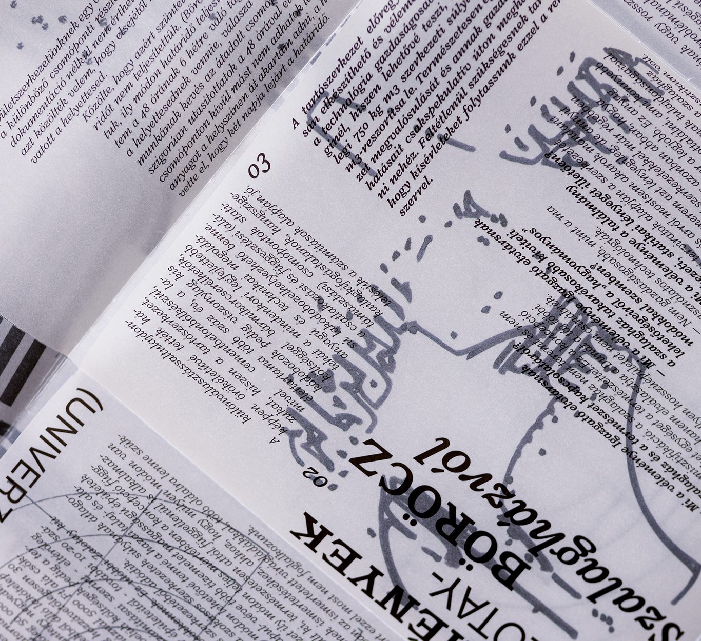
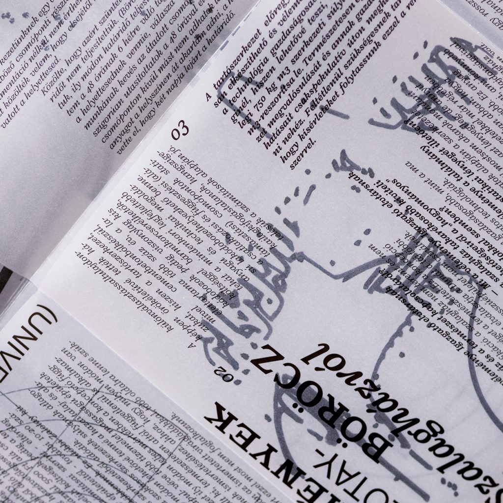
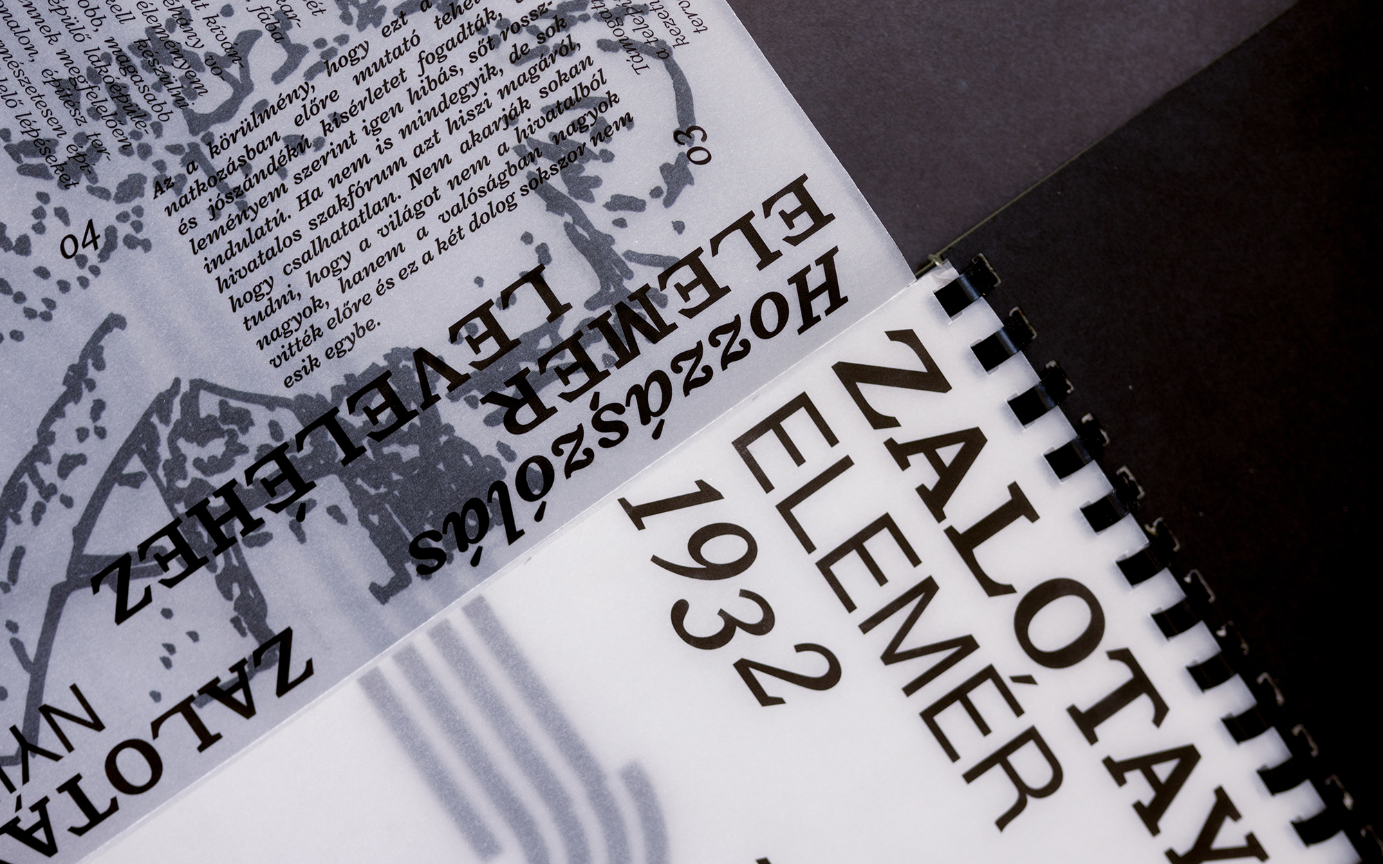
ZALOTAY PUBLICATION
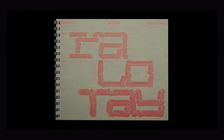
This project is a homage to Elemér Zalotay’s oeuvre, in particular his strip building concept. The design was created to address the housing shortage in the wake of World War II according to Le Corbusier’s utopian architectural vision. The building was designed as a 20-30-storey high structure but has never been built. Bercel’s publication offers a poetic, contemporary response from the 21st century to the accumulated unrealised designs.
“Zalotay was left with no opportunity to start a relevant dialogue on professional platforms, forcing him to publish his story and ideas in literary journals in the form of open letters, which received both positive and negative feedback in similar papers. This publication is based on a selection of these articles, which also provides insight into the Kafkaesque absurdity of the system and showcases the foundations of his concept.”
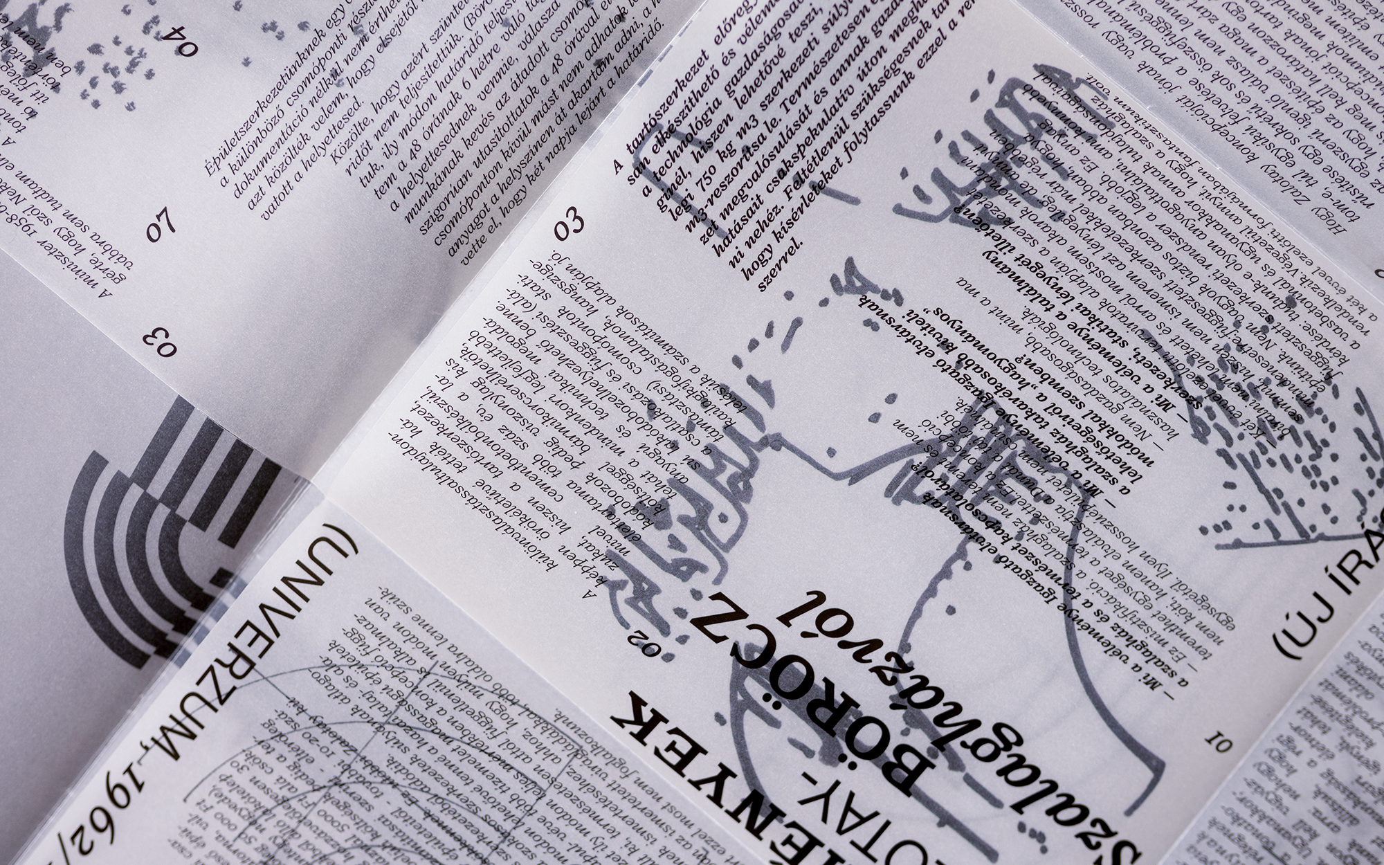
Bercel’s completed work is a visual abstraction of this story, reflecting on the immensity of Zalotay’s concept, the visuality of press products in the Kádárian era, as well as the deconstruction of classical modernism that is also apparent in Zalotay’s oeuvre. As showcased by this project, Bercel’s perhaps strongest suit is his ability to maintain a state of authorial exhilaration even in extreme situations. He is transformed in the adaptive process and yet retains his own voice. His work definitely deserves to be followed in the future.
// /
The designs were completed at the Graphic Design BA of Moholy-Nagy University of Art and Design. Bercel’s supervisors were Béla Frank, Balázs Vargha, Péter Simon and Tamás Marcell.