The limits of legibility – Rebeka Orosz’s Disfluex diploma project
Rebeka Orosz’s project Disfluex explores the subject of the disfluency effect, in particular whether poorly legible typefaces can promote cognitive information retention. She designed a website for creating questionnaires that can ease the preparation of visual materials for legibility research, while her thesis looked at whether the typography of textbooks affects the motivation and performance of students.
This is a complex topic. What difficulties did the visualisation of your research present?
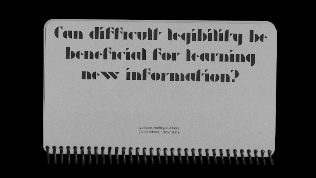
In my thesis I presented at length the learning methodology of desirable difficulty, proposing that even though an external obstacle in the learning process will slow down the process, the increased cognitive demand will cause the information to be fixed in the mind more clearly. Reducing legibility can also produce a sort of desirable difficulty termed disfluency effect by literature. The relevant research, however, shows inconsistent findings, which means the effectiveness of the methodology has not yet been clearly demonstrated.
It is a relatively new area of research, studied only by very few professionals globally, and this, for example, proved to be a difficulty.
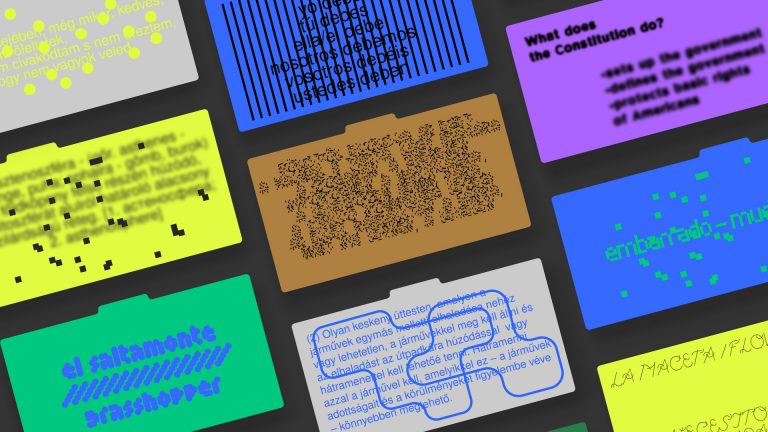
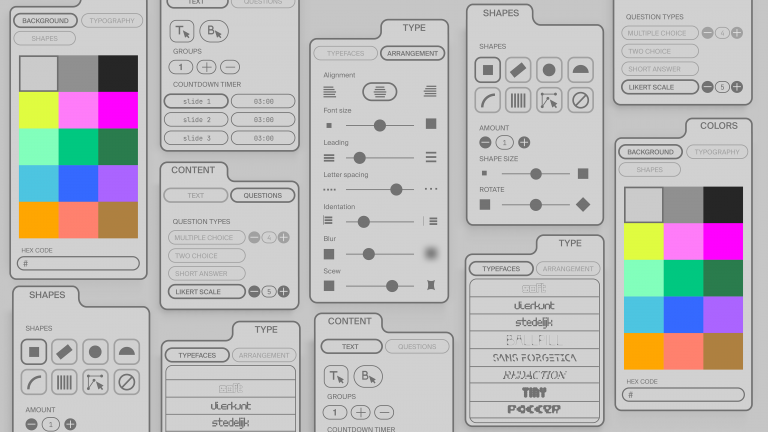
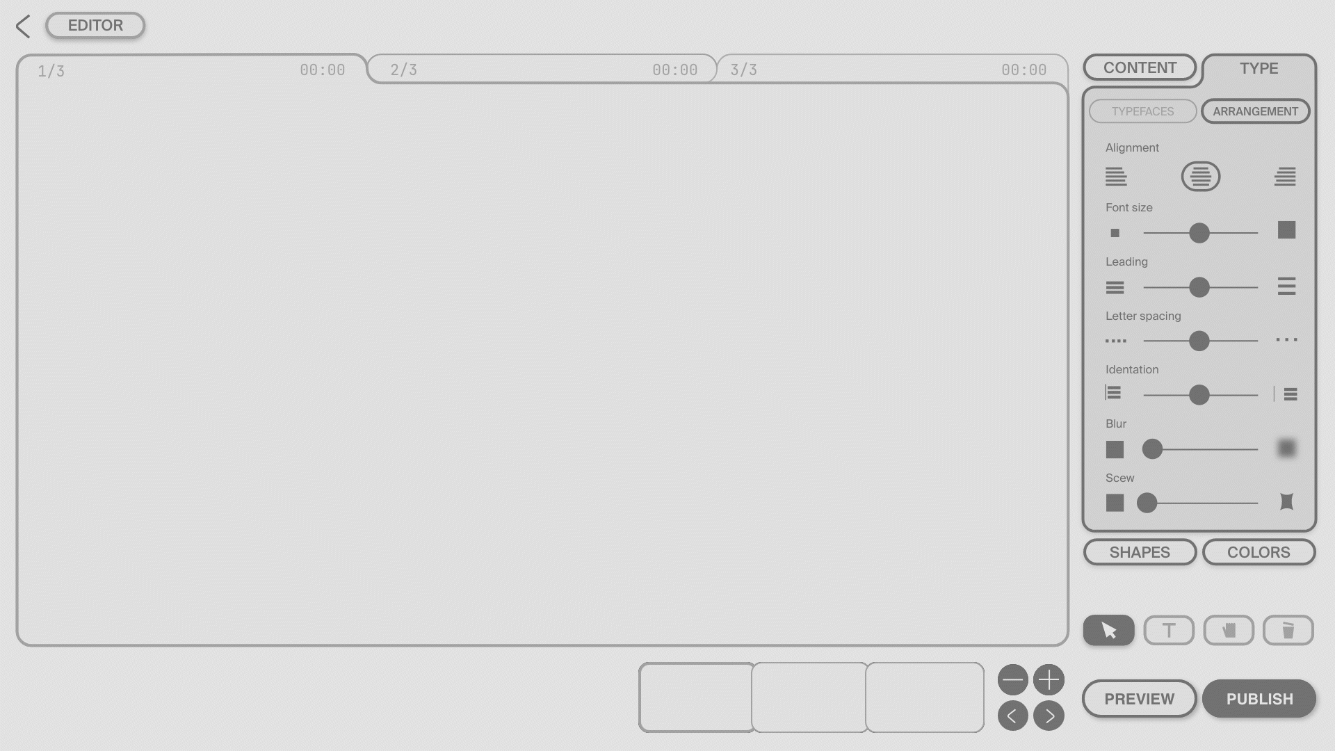
Visually, the limited design elbow room presented the most challenge, given that my project is about providing reading researchers with a typographical toolset they can use to create additional visual interfaces by building questionnaires and measures.
What inspired the design? Can you name projects that you consider exemplary and helpful for implementing your own ideas?
In my research I was mostly influenced by studies by Myra Thiessen and Sofie Beier, confirming that my choice of subject was justified, and supporting my preliminary assumption that it would be important for collaborate with reading researchers engaged in typography with typographers. Avantgarde children’s books such as Die Scheuche byKurt Schwitters or About Two Squares by El Liszickij were somewhat more remote sources of inspiration. It was liberating to see that experimental typography was already used in publications for children a long time ago.
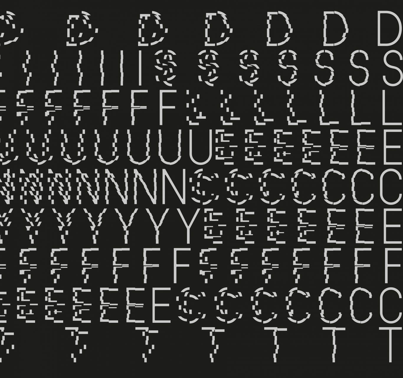
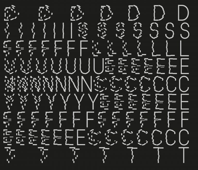
Disfluex font manipulations
Why do you think it is important for graphic designers to take a role in educational matters and research collaborations?
I’ve already mentioned that there is no consensus as to the effectiveness of the theory. What I haven’t mentioned yet is why I saw the potential of this subject as a designer. The reading research I know almost exclusively involves cognitive professionals and behavioural researchers. I can only give you a single example of a research involving typographers, and that is the creation of the Sans Forgetica font. Most commonly, research of disfluent typography compares text retention by the subjects using readily and poorly legible fonts. The research I found suggested no significant difference between the two legibility categories, and the fonts labelled as poorly legible (e.g. Comic Sans, Bodoni MT, Monotype Corsiva) were not at all difficult to read. The hypothesis I formulated for my masterwork therefore assumes that increasing the level of illegibility of the disfluent category compared to the fluent one will sooner yield some results regarding the effectiveness of the theory. I for example see this as the role of the typographers.
There are many other areas, such as the development of educational aids, where designers can use their visual expertise to support the work of professionals of other disciplines.
Who would you enjoy continuing working together on the project?
My diploma work draws attention to the possibility of multidisciplinary collaboration. I would enjoy best working on this project as part of a research team rather than alone, precisely because we could each bring different competencies to it.
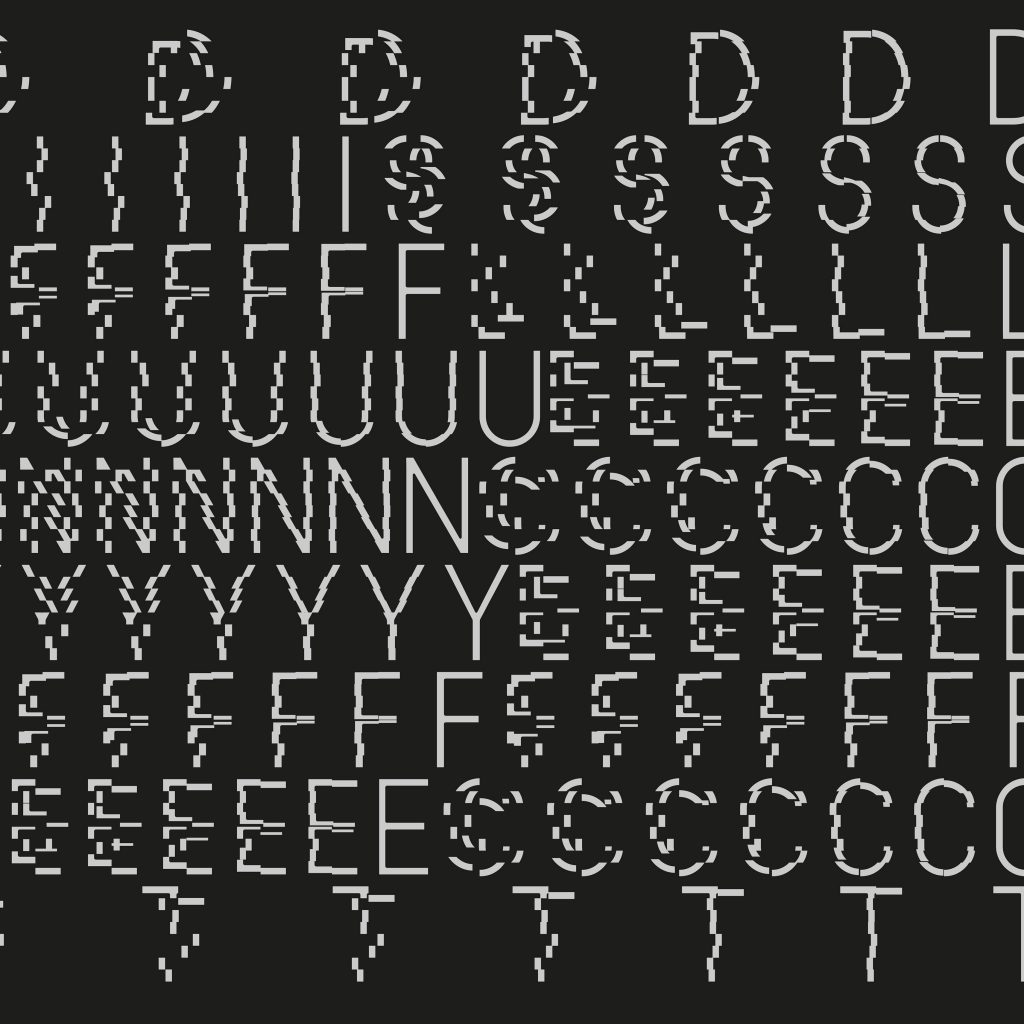
Disfluex form variations
How would you describe the visual sensitivity of a young school child in today’s Hungary? Do you think teaching it at school is currently a priority?
My research explored the questions how sensitive children to typography are, which age group is the youngest to perceive the difference, how critical they of their textbooks and if they had any typographical preferences. The survey included 106 3th and 4th graders, who were required to evaluate texts designed by me versus page pairs from their own reader. Even though the findings are not representative, they suggest that the children could not really perceive the difference between a well designed and a poorly designed text, and that there is no clear preference for a specific type of font or paper. At the same time, though moderately, they appeared to be critical of the visual aspect of their textbooks, and were very enthusiastic in their reception of visual novelty.
In my experience very few teachers find increasing children’s visual sensitivity important.
This don’t need to be and can’t be taught; instead, attempts could be made to create an all-encompassing visual environment at school and in terms of educational aids that could make learning more enjoyable, positively affect learning performance and last but not least be suited to improve public taste.
What was your favourite part and which part do you think still needs improvement?
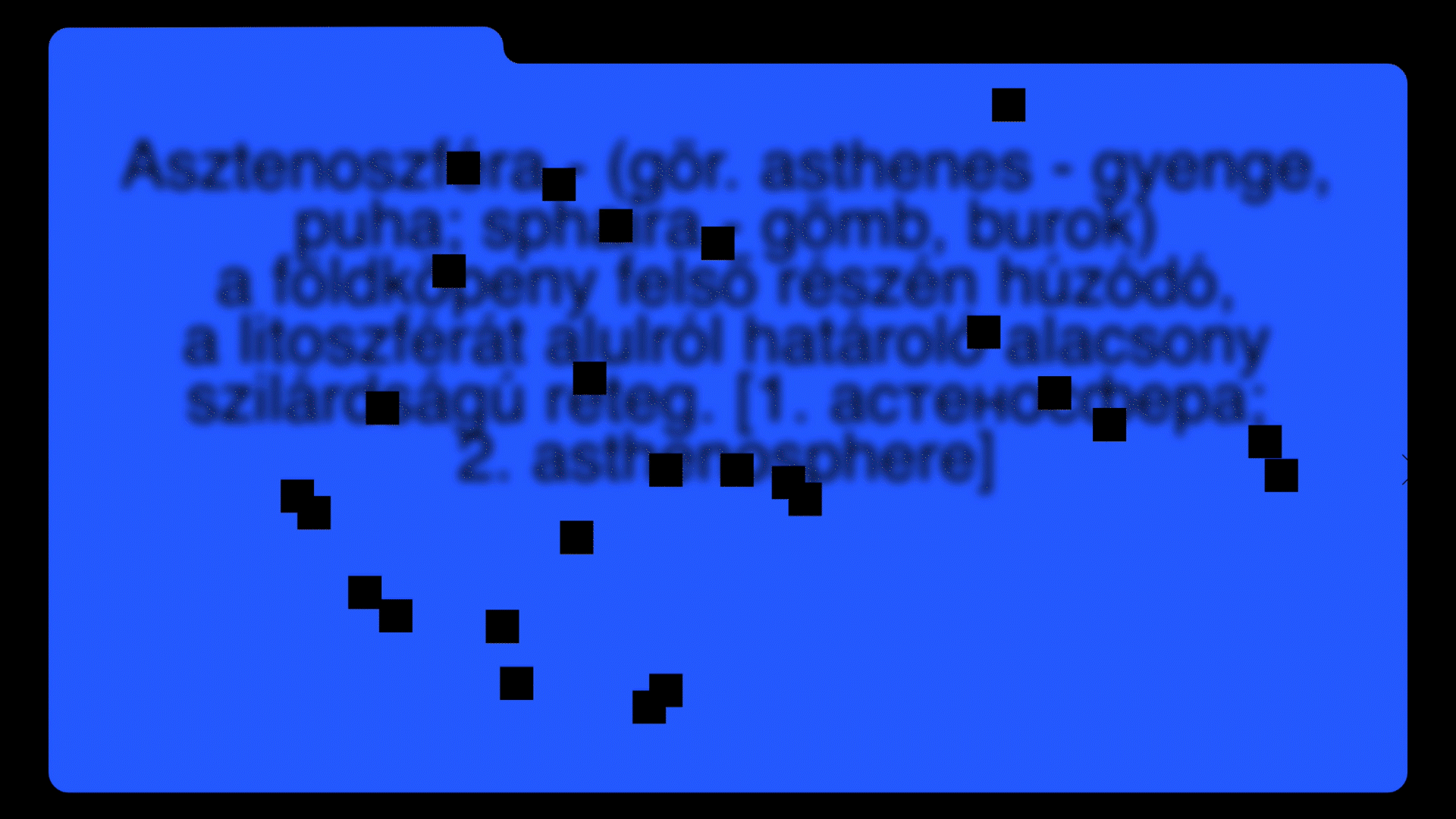
Several reading research papers on typographic disfluency mention the fact that the optimal level of legibility is not known. I am essentially interested in typeface design, which is why I designed a typeface as part of my masterwork, proposing an answer to this issue. This is a variable set with one end of the spectrum being completely legible, and the other illegible, allowing countless further variations to be generated and the desired optimal difficulty level to be selected individually.
Disfluex booklet and typeface
Is choice of colour part of the research or is it only aesthetic?
I could not find any relevant research. The website offers a basic colour set for changing the colour of the fonts, the background and the various blotout shapes. I have picked several colours that yield low-contrast colour pairs when placed next to each other. This could be another way to reduce legibility. At the same time, individual colour codes can be entered for additional possibilities.
What plans do you have for the typeset you designed? Have you thought about contacting any of the type foundries?
Typeface design is among the things I would like to continue doing in the future. I would like to offer the variable typeface in its current form for research purposes to test its effectiveness, though I have no plans for a more specific methodology. If I called on other type foundries it would be to find out if they would be interested to offer some of their fonts for research. This way, contemporary typefaces could take on a new role by being used in scientific research.
// /
The masterwork was completed at the Graphic Design MA of Moholy-Nagy University of Art and Design. Supervisor: Dóra Balla. Thesis consultant: Andrea Pallag.
You can follow Rebeka Orosz on Instagram HERE.